|
|
|
|

Hello everyone,
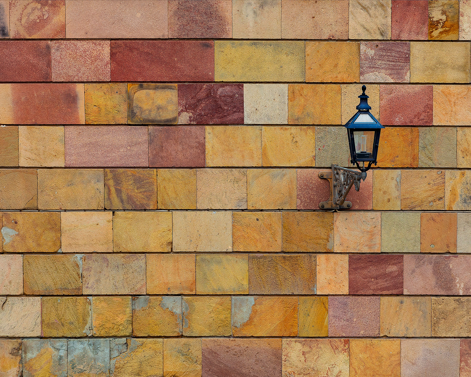
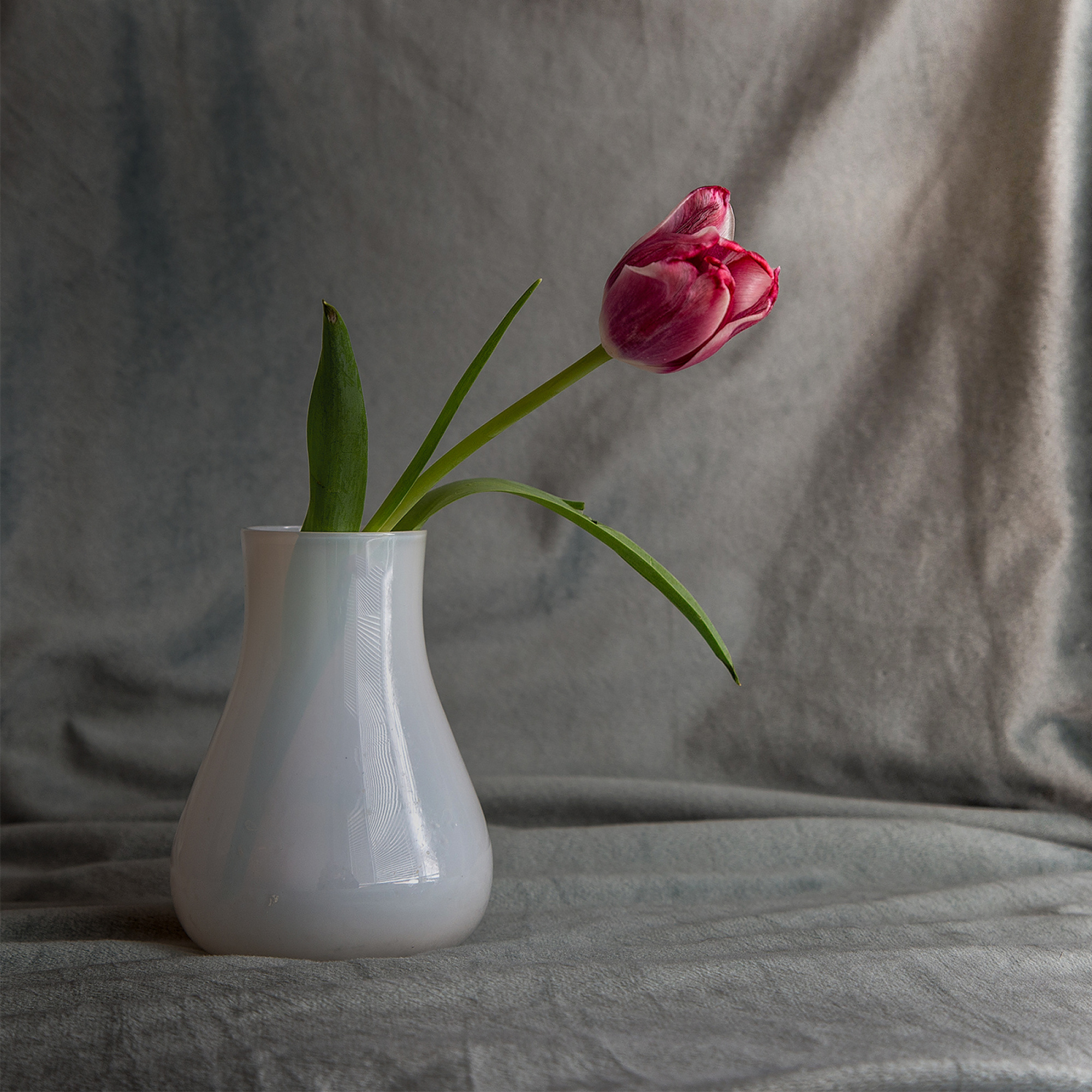
I don't know where I took this picture, I liked the lamp agains the wall, a simple subject. I shot it with ISO200, f6.3 105mm (75-200mm f4 lens). There is not a lot of post processing done, sharpening, clarity, perspective correction, contrast and saturation.
I still struggle with colours so I wonder if I pushed the colours too far, there is very little gammut warning, but are they good enough?
As usual, any other suggestions, ideas, critique are welcomed.
Thank you for your time
Calin
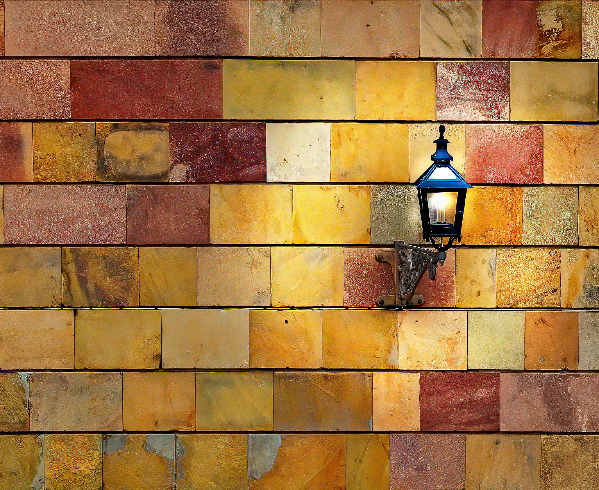
Hi and welcome back I see an image all about colour and texture but lacks impact and power. So Just a few ideas for you to have a play with - Saturation +10 Small crop off the bottom and left side. Nik Tools Tonal Contrast to add texture and colour. - Reduced the exposure just a little some dodge tool work. I then added an extra layer mode colour dodge to light the light


Hello, Calin
Welcome back. I also like similar compositions. Yet the interpretation of the image can change from peron to person. Let's see how much ours will overlap.
It is surely a minimalistic composition. The geometric lines help to find the subject. However, the different colors make it not easy to spot the lamp. You chose your aspect ratio as you found pleasing to your liking. If it were me I would frame the image 2:3 and place the subject to the lower left. Why? Because I read in a photography magazine that minimalistic close up compositions with a single subject are best interpreted this way. So, I stuck to it. As the subject is vertical I would prefer to use the aspect ratio vertically. If the image were B&W the lamp would not be easily recognizable. So color is best. Yet the saturation might be lowered. These are my inputs. I wish you good light....
Callin and Cicek,
I like the composition of Cicek and I hope Cicek has no problem with my suggestion. Before I did the crop like Cicek I cloned the lamp and in this way more structurte is visible. Theo L.

Sorry an earlier photo was also there. And Cicek after you have seen this you may remove this comment.
Hi Calin. This is a fab image - well done. I won't offer an alternative because I love yours and you have some great options provided by others. But apropos the colour space (gammut). This is one of the most complex areas in photography / processing and "it doz me head-in" every time I deal with it. However, essentially, your camera will have shot within one gammut; your software will process within another; your monitor might display another and your printer might print in yet another. The "Big Two" are sRGB and Adobe-RGB (there are others). Essentially, the latter is larger than the former BUT the former does out-stretch the latter in some zones. Generally, I try to stick to Adobe-RGB throughout and printing (or convert to CMYK*) - save in sending to screens, when sRGB is the one in use (most screens cannot display large chunks of Adobe-RGB). I use a monitor (Benq) which operates in Adobe-RGB or sRGB but, unless they specify, monitors usually only use sRGB.
By the way, don't forget that, even with the same colour-space, different cameras shoot colours differently: Canon colours are not those of Sony, etc.
So I do not know which colour-space / gammut was giving you a warning but, in this day-and-age, we all have to accept that, if published on the Net, users' experience will be many and varied. Even with sRGB, my Chinese 'phone will display colours differently from an iPhone, which is different from a Samsung, etc etc. Then peoples' eyes vary considerably. Unless we are colour-blind, we can all agree which basic colour is green, sure - but it is almost certain we are seeing a vwide variety of greens, even from one original - but we do not realise.
So your concern over colour nuisances is, perhaps, to little avail. All that "beyond gammut" means is the software will, instead, display the colour in question in the nearest approximation of the original colour it can in its particular gammut. It is not a disaster. Of course, if you are doing commercial photography (say for Coca-Cola) they will be precise in their requirements about colour - especially that Coke red. (Pantone colous are the standard here). Also, if you are concerned, you can calibrate your monitor using a "Spider". It is a physical device (plus software) which dangles in front of a monitor. Whilst its software displays various colours, the spider has a photo-sensor and reads what the screen is actually displaying - then the two can be calibrated.
If you are printing, you can always print test sheets (say A4 or A5) to physically compare with the on-screen version, to see if they match (or, even if they don't - are you content?)
Hope some of that helps. Cheerio.
* CMYK = Cyan-Magenta-Yellow-Black, as in printing inks.
Hi and welcome back I see an image all about colour and texture but lacks impact and power. So Just a few ideas for you to have a play with - Saturation +10 Small crop off the bottom and left side. Nik Tools Tonal Contrast to add texture and colour. - Reduced the exposure just a little some dodge tool work. I then added an extra layer mode colour dodge to light the light
HI Daniel. I like your illuminationm of the lamp. I've done similar to car headlights before and it really lifts an image.
Thank you everyone for the comments.
Daniel Springgay I love the suggestion, I will try and see how far I want to go. Theo Luycx, Cicek Kiral Your thoughts are much appreciated, but they move away from the subject which for me is the wall and its colours. The lamp there is just to break the pattern. Woad Visage thank you for stopping by, the warnings I get are minor and in the dark lines, I think I didn't ask the right question, maybe more about how natural they feel. Of course going from camera, to screen, to paper (to different paper :) ) will create subtle (or not so subtle) variations. Your advice and comment is much appreciated.
cheers,
Calin
Hi and welcome back I see an image all about colour and texture but lacks impact and power. So Just a few ideas for you to have a play with - Saturation +10 Small crop off the bottom and left side. Nik Tools Tonal Contrast to add texture and colour. - Reduced the exposure just a little some dodge tool work. I then added an extra layer mode colour dodge to light the light
Daniel, how do you add 'extra layer mode colour dodge'? can't figure that out.
Cheers,
Calin
Calin see link to youtube vidio simple way to show you how. copy it into you browser
https://www.youtube.com/watch?v=4Y96iRJ5DS0&list=WL&index=14&t=92s
