SEARCH


|
|
|
|


Hello,
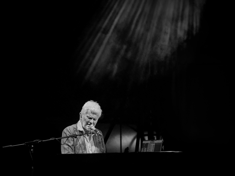
I would really appreciate any feadback on this photo. What do you think I could improve? Any suggestions are more than welcome. I want thinking for title, Piano Light or Under the Spotlight.
Thank you!
Good light,
Valentin Borsan
Hello, Valentin
Welcome to our forum. The light in your image looks interesting. I wish it had reached the subject more. The composition needs refining. There is too much distance with the subject and the light from above. The most important refinement, though, should be on the extreme dark areas in my opinion. Were it not for the microphone, guessing the man was playing the piano would be definitely difficult. The subject needs a reduction in highlights and a better definition of, contrast or sharpness to match the dark areas. If you can re-edit the original by keeping texture and specific detail in the black parts, I think your image would get better votes. In images like this one the environmental information should also be partly included.I wish you good light...Cicek
Valentin,
Thanks for sharing the photo with us in Critique Forum.
I like the concept of a musician concentrating on his work, spot-lighted in a big, empty space. It's dramatic. We can imagine the music filling the room.
A few editing suggestions you might want to try. The details to the right of the piano player are distracting. It looks like a laptop screen when you zoom in. Perhaps it's how he reads the musical score, but it seems out of place. It was easily removed with the 'Remove' tool. It's a relatively new tool in Photoshop, and is bundled with the Spot Healing Brush tool. Right clicking on the Spot Healing Brush tool allows access to it.
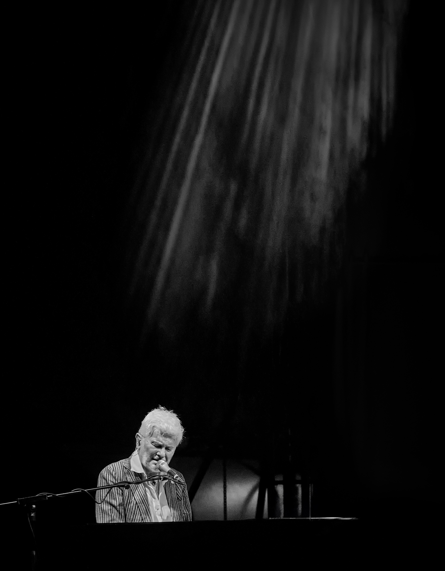
The light seems as important as the subject, so to exaggerate that some some blank canvas was added to the top of the frame with 'Image>Canvas Size', then a selection of the top of the frame was made with the 'Rectangular Marquee tool', then that area stretched higher with 'Edit>Transform>Scale'. (holding the Shift key down as you pull the handles will restrict the transformation to one dimension - either height or width). The 'Dodge' tool was used to brighten some of the light rays. A small crop of the right and left made the frame more vertical to emphasize the light coming down from high above.
Suggestions only.
. . . . Steven, senior critic

Hello, Valentin
Welcome to our forum. The light in your image looks interesting. I wish it had reached the subject more. The composition needs refining. There is too much distance with the subject and the light from above. The most important refinement, though, should be on the extreme dark areas in my opinion. Were it not for the microphone, guessing the man was playing the piano would be definitely difficult. The subject needs a reduction in highlights and a better definition of, contrast or sharpness to match the dark areas. If you can re-edit the original by keeping texture and specific detail in the black parts, I think your image would get better votes. In images like this one the environmental information should also be partly included.I wish you good light...Cicek
I agree with everything Cicek mentioned and I'd like to add that not only do the light rays cut off too short, I feel they are in the wrong place and direction for the lighting that is on the musician. If you look at his body, and examine how he is lit, the light is coming from the upper left. To me it looks like the rays were added in post and placed in the wrong position.
All the best,
Tammy