|
|
|
|
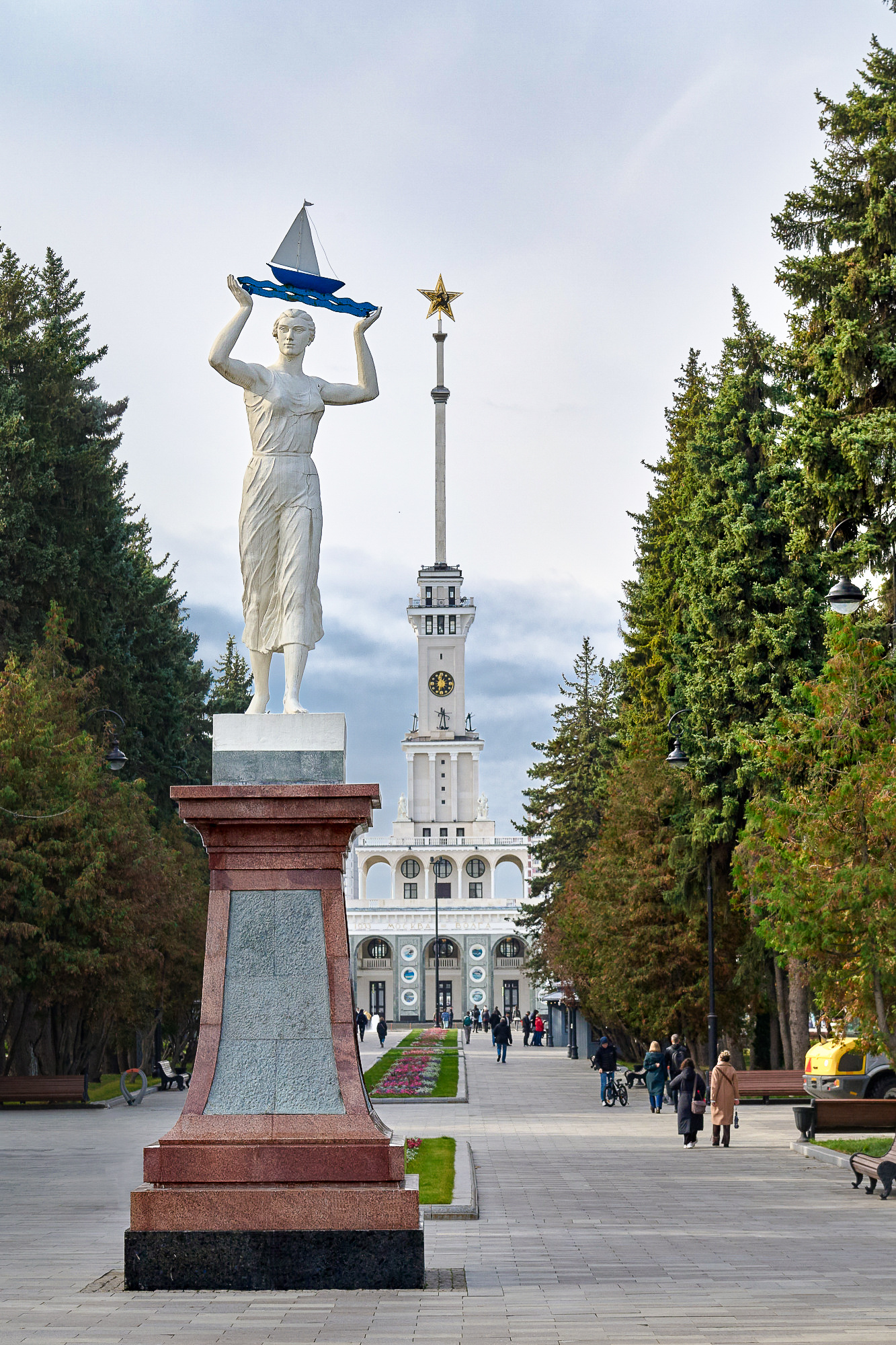
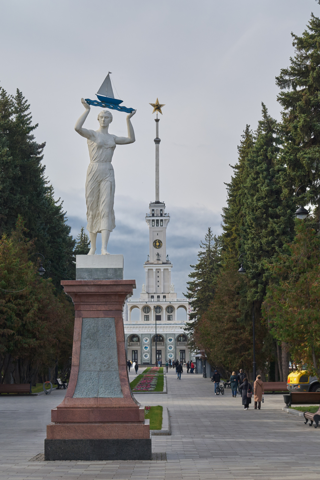
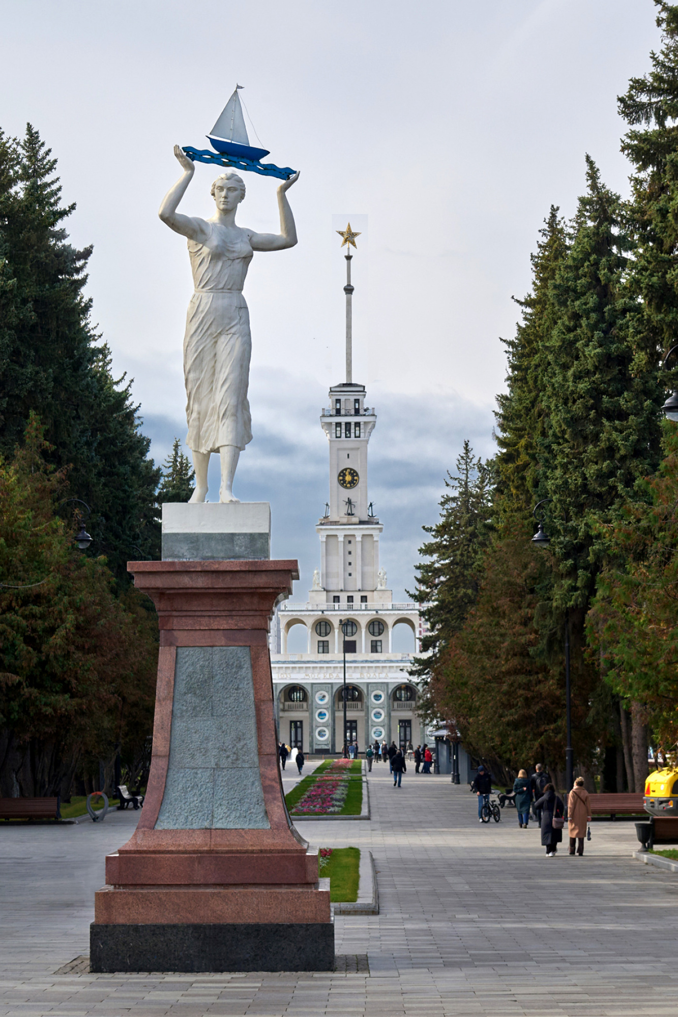
Dear experts,
I`d appreciate your recommendations on how to improve expressiveness of this cityscape.

Hello, Kirill
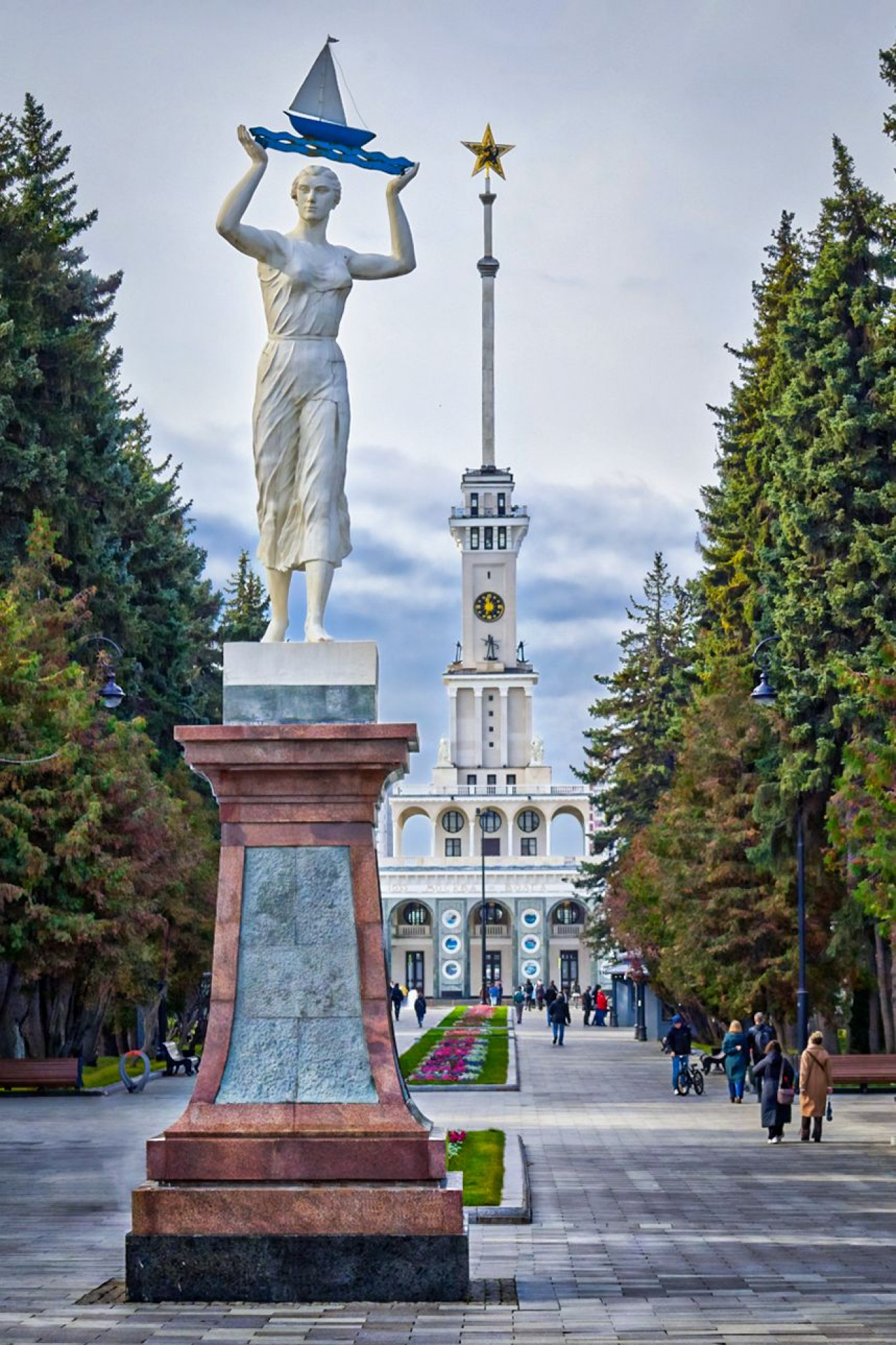
Welcome to our forum and thank you for uploading your image. Your image is quite fine just lacking some dynamics. The light falling on the statue needs to be enhanced and brought to sight. As another important retouch comes the addition of contrast and sharpening. Apply sharpening and contrast slightly on the whole image. Then sdd more sharpening and texture to your statue and the building in the back to bring them out. When you darken the whole image you will see that the light on the statue will increase. Do not darken it excessively just slghtly. You might also want to increase the dehase slider to bring a clearer and more defined view to your image. These are discovering steps with little moves of the sliders. It is all hidden in the following adjustments: Exposure-shadoe-blacks-clarity-texture and contrast. Explore and see what changes. This is better for the photographer to see what each does to the image. I learned my editing with exploring and monitoring the changes related to this. A little crop starting from the right upper edge will draw the attention more to the statue. Then liven up the trees, they are good natural frames to your image. Add some clarity and contrast to the ground to bring out the leading lines. They are very helpful to make important aspects easily recognisable. Below is my suggestion for a more dynamic image. I preferred a bluer tone for a more dramatic one. I wish you good light...Cicek
Kirill,
For me asks the tower behind next to the monument too much attention and is a little bit disturbing. Removing should be a solution, but that is not nice for an existing tower. So I had another idea. I made a duplicate of your image , removed the top of your first one , selected him in the duplicate and placed him back in the first one. But now he is on a second layer and you can make him smaller. A strange idea but the result below. Theo L.
Dear Cicek,
I`m grateful for your unique gaze and step-by-step tips! You have filled with life in it!..
Kindly thank you!..
With best regards, Kir
Dear Theo, I`m grateful for your gaze!.. You're right, the prospective got better!..
You have filled it with the air and volume.
Kindly thank you,
With best regard, Kirill
Hello! I'm far from being an expert, but i enjoy to edit your photo for a while lol so here it goes.
I just used some masks on the lightroom, 2 gradiant on the trees (left darken it a bit and right doing the opposite), blow up the sky because i feel it drives my attention to the statue, and last i use another mask on the statue in order to make it "pop".
I've thought you may have think this pic without much contrast, so i decreased it hard so i could keep that mood. I've did this in lightroom. Sorry if im not suppose to interact here lol but here it goes anyways, wish it can help. *forgot to mention, i blowed the sky on tonal curve, enhancing the highlights, and after darken the blacks a bit.