|
|
|
|
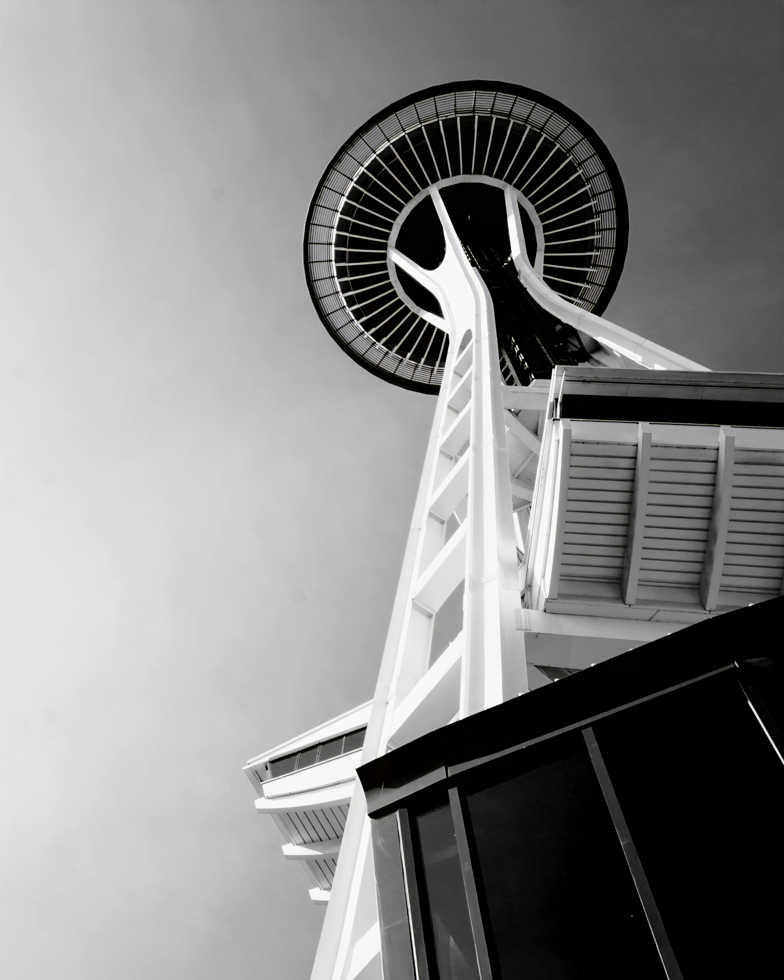
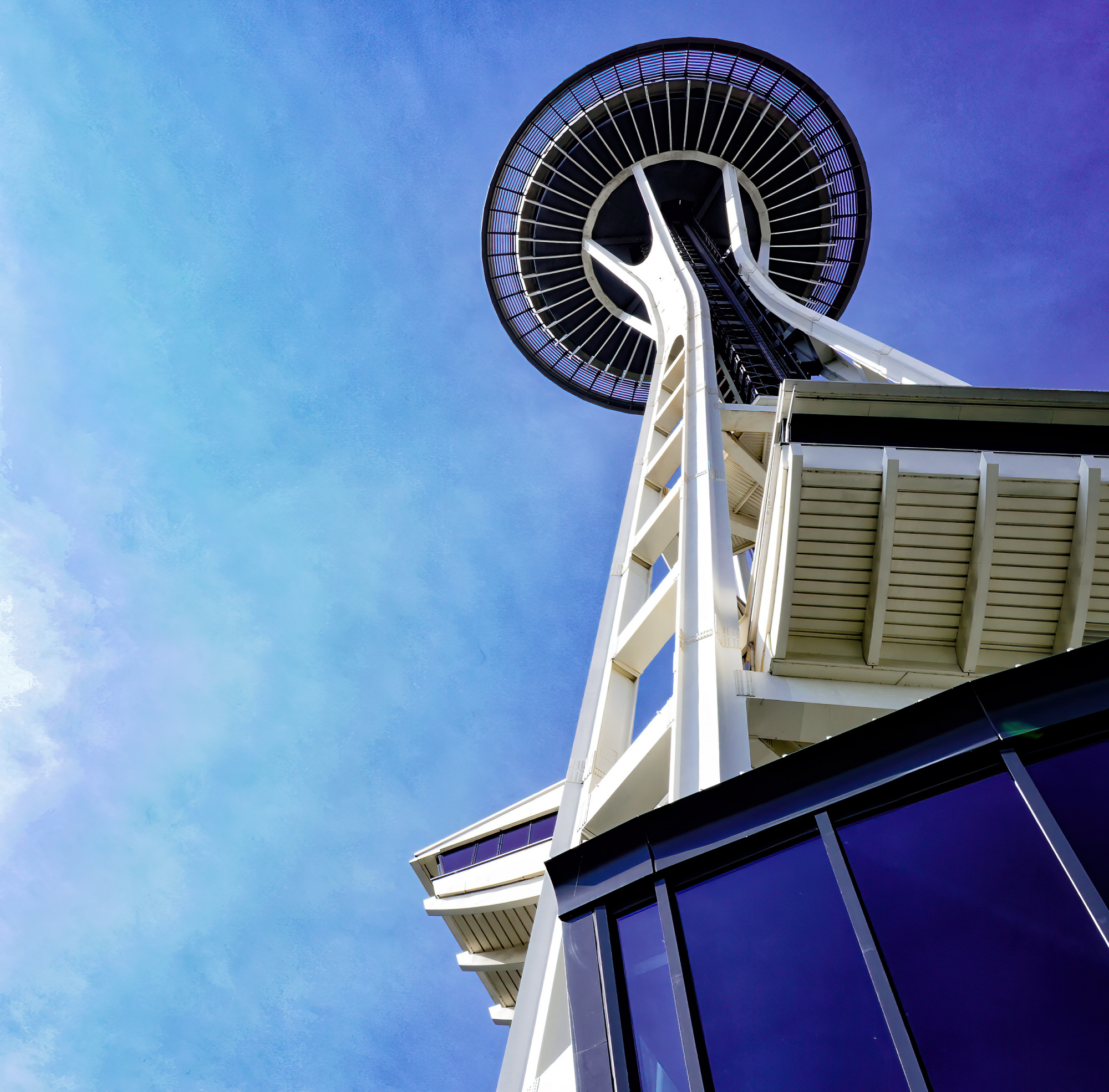
I took this picture back in 2017 and when I typically take these types of photos, my general intent is to capture the sense of grandeur that iconic landmakers give off. I recieved 3 stars on all of the feedback categories when I had tried to get this published through 1x and the only remark I was left with was "this makes me uncomfortable". So I asked for a follow-up critique and was directed here. I had listed the photo under the subject of architecture where I now understand are general rules they follow in terms of composition. So I may have challenged the norm there by capturing the space needle from this angle. Regardless though, I uploaded it to that category because it seemed the most fitting.
For the ciritique I am requesting, I would like critics to treat this as a general street photogrpaher taking their one-of pictures of an iconic space they came out of during their travels. Thats the scenerio that I was under when I took this. Coming out of the building and looking up and just seeing this scene seemed so surreal to me and that sense of amazement is what I wanted to display.
Thank you,
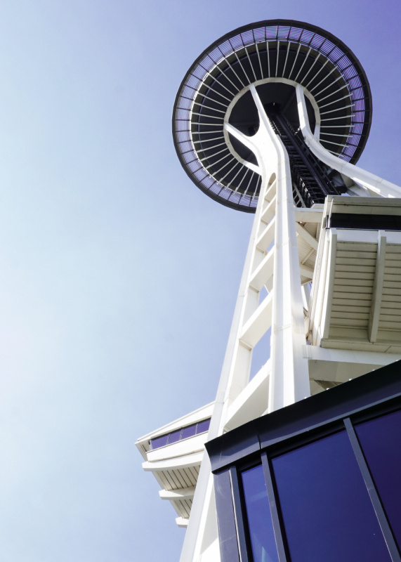
Hi and welcome again. I've chaged the framing as you can see reduced the whites in camera raw 100% as I thought it was over exposed Dehaze +50 to add punch last Nik tools tonal contrast to put texture in the sky I had to clone out some dust bunnys in the sky about four of them - Last Topaz AI Sharpen for that Pro look.
Hello Braneo, thanks for posting this image.
I see Daniel removed some sensor dust. That is the first no-no: always do (i) Edge-Patrol for irrelevencies and (ii) Sensor-dust removal, before posting any image. The point is, one needs to show one really cares about one's image before asking anyone else to. Now, we all make errors - I have missed sensor-dust on my own images - but it does give a poor impression. Daniel was very charitable; others might not be.
It looks to me as if you were limited by lens and space when shooting this. But, ideally, my preference would be about the same amount of negative space but cropped somewhat on the left and with more headroom at the top. That would enhance the sense of height and grandieur.
Next, architectural photo rules. My suggestion is to print them and read them. Then send those print-outs to recycling and forget them. We need to know rules - but ought regard them as possible tips, at most - if they help one see some possibilities one would not have, fine. But be true to thine self. Do your own thing, else you might as well just print-out someone else's photographs. This applies to us all, of course.
Back to Daniel. His tastes and mine usually differ: he likes far punchier images than I do. However, in this case, we are in agreement - I think his changes to light and colour are not just excellent (as always) but completely in-line with what I would have suggested, had I done the work he has. Thing is, this image is taken in broad, bright daylight where colours and punch will be maximised. The only snag might be light-haze. But Daniel has erradicated that.
Do not be too hung-up on people's marks and tick-box responses - as a minor curator, I find it difficult to be accurate via those methods. And if you are not published on here (i) try again sometime - the advice here might help and (ii) Be content with your creation. oh and (iii) 1X.Com is only part of the world!
Cheerio.
Thank you,
It's very much appreciated !
Braneo
I a little late to the party in terms of my comments. Somehow I missed this when looking at the submissions.
I really like the general composition - very well done.
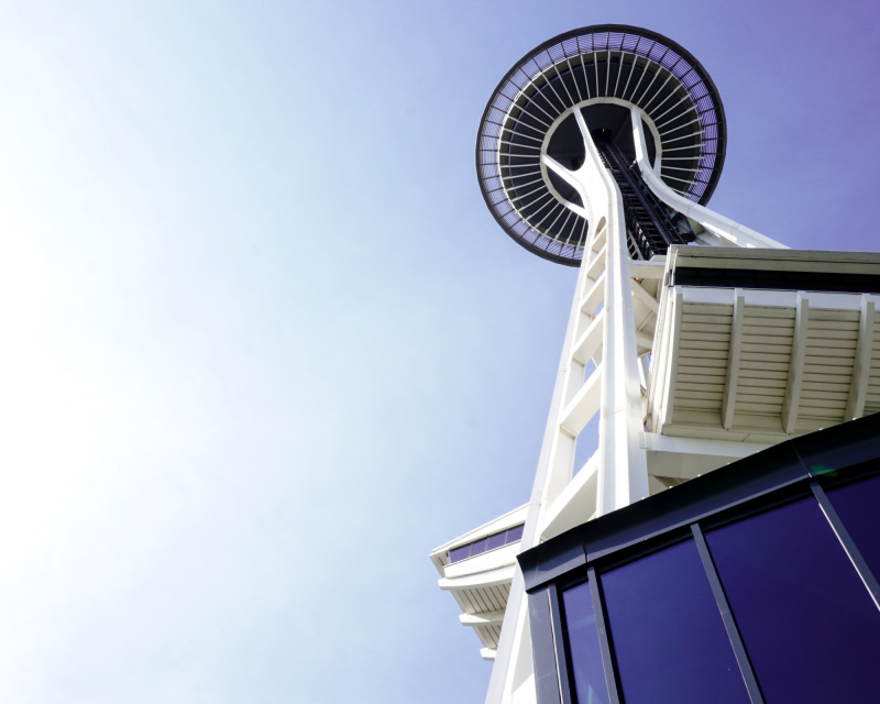
Personally I think a portrait (vertical) aspect ratio works better as the subject it vertical. In looking at the vertical image you submitted the only composition issue for me is that there needs to be more "breathing space" for the top of the tower along the top and right edge. In the horizontal image there is plenty of space to the right but the top is too tight. For the screenshot below I used your horizontal photo and applied a vertical 4:5 aspect ratio then applied a generative expand to add more sky to the top for the breathing space.
In term of editing you might want to consider a BNW treatment. The image has a limited color palette (blue & white) so a high contrast BNW could work nicely.
I hope this gives you something to consider.
Best wishes,
Mike S. - Senior Critic