|
|
|
|
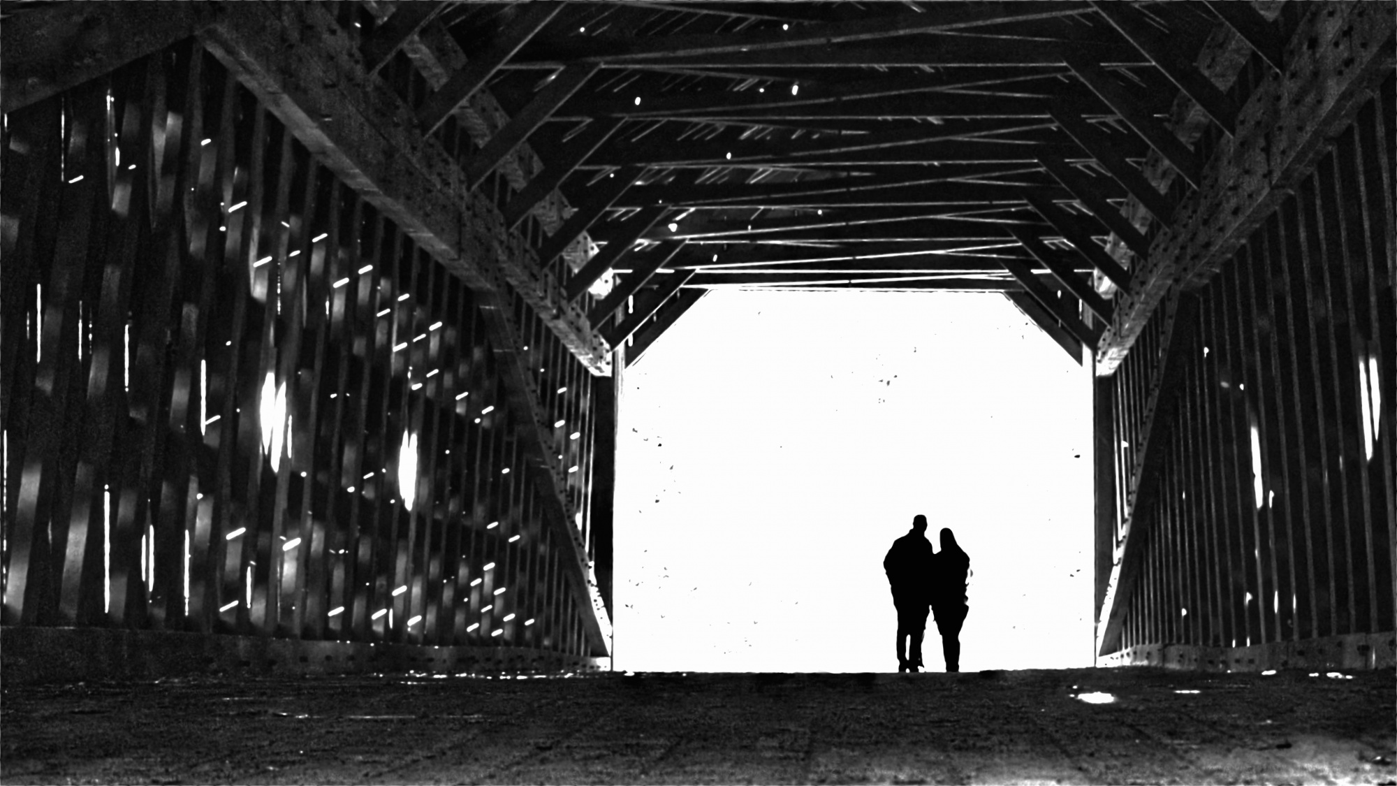
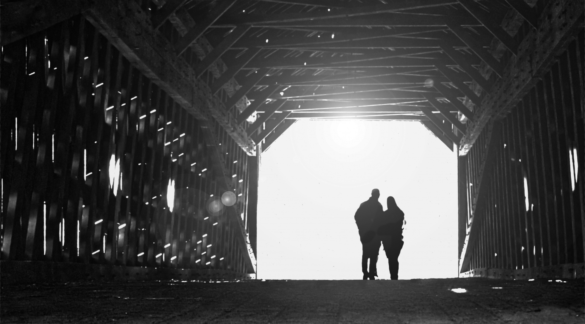
I've been working on a number of different iterations of this image for a few weeks now and have gotten a few construtive comments from other sources. I was hoping the 1X critics might take a look at this and give me some thoughts regarding the image and some possible areas for improvement. Personally, I'm not totally convinced that the light at the end of this tunnel is right, however I do like it.
Your comments would be greatly appreciated.
1/125, F6.3, iso 1600, Fl 70. Affinity photo software.
Thgank you,
Patrick
Patrick Compagnucci Hello,
I am curious about the speckled dark dots in the bright light at the end. I like the light, I just wished it were a smaller space, to tunnel the vision better into the two figures. I cannot wait for the experts to comment on this.
Hello, Patrick Compagnucci
Welcome back to our forum. Thank you for submitting this interesting image. It won't be very easy to comment on this. Because I could not really decide if I liked the image or not. When looking at the conversation, I can say that you know what you are doing. You know the rule of thirds and you know where to place the subjects. However I'm not much sure about the lights sparkles and the black dots at the very back of the image. If I have to speak about the sparkles off light inside the metal structure, I can say that their intensity caused some textures to have gotten lost. When I look at the black speckles on the white background, I think that the man and woman are watching something related to them. So their positioning gives me this impression. As if there are black particles flying around in the air. This is the place where I'm not sure about my feelings about this image. On the other hand, the white bright lights speckles on the metal structure, and the black particles on the white background are contrasting . This is a good quality in your image. I think that having chosen to edit this image in black-and-white, was a very good choice. I also think that if the white area has been smaller, and maybe a little less bright it would have much more effective. These are my personal views, I'm sure my friends will have much other ideas on your image. I wish you good light....Cicek Kiral senior critic.
Patrick Compagnucci Hello,
I am curious about the speckled dark dots in the bright light at the end. I like the light, I just wished it were a smaller space, to tunnel the vision better into the two figures. I cannot wait for the experts to comment on this.
Hello Marie,
Thanks for taking the time to comment.
The speckled dark spots in the light area are remants of trees/leaves, that were left over after I processed this image. I have been conflicted about either totally eliminating them, or trying to make them more discernable in the image. I also agree that the light area at the end looks to large, but didn't have a clue as how to remedy that situation.
Thanks again,
Patrick
Hello, Patrick Compagnucci
Welcome back to our forum. Thank you for submitting this interesting image. It won't be very easy to comment on this. Because I could not really decide if I liked the image or not. When looking at the conversation, I can say that you know what you are doing. You know the rule of thirds and you know where to place the subjects. However I'm not much sure about the lights sparkles and the black dots at the very back of the image. If I have to speak about the sparkles off light inside the metal structure, I can say that their intensity caused some textures to have gotten lost. When I look at the black speckles on the white background, I think that the man and woman are watching something related to them. So their positioning gives me this impression. As if there are black particles flying around in the air. This is the place where I'm not sure about my feelings about this image. On the other hand, the white bright lights speckles on the metal structure, and the black particles on the white background are contrasting . This is a good quality in your image. I think that having chosen to edit this image in black-and-white, was a very good choice. I also think that if the white area has been smaller, and maybe a little less bright it would have much more effective. These are my personal views, I'm sure my friends will have much other ideas on your image. I wish you good light....Cicek Kiral senior critic.
Hello Cicek,
Thanks for taking your valuable time to comment. I'll try and explain what's going on here.
The structure is an old covered wooden bridge, made mostly of large heavy timbers. The exterior clading and roof are basically wood which, thru the years, has deteriorated to a point where there are holes in the cladding. The lights you see on the walls, floor and ceiling are sunlight filtering thru the holes into the structure, and also a few small windows. I thought that they created an interesting light and shadow effect. The people just happened to be there so I was lucky to catch them in that position. I've already explained the black speckles to Marie, so nothing new to add there. Also, I agree the bright white area appears to large, but I really have no idea what to do about that. Hope this kind of clears thins up.
Thanks again,
Patrick
Patrick,
Thanks for sharing the photo with us, and also for including the exposure settings. You know we appreciate that.
It would be difficult to make the opening at the end of the bridge smaller, but you could easily make the figures larger. That changes the mood of the photo, and one could argue that very small is OK too. I don't know the process for Affinity, but in Photoshop if you make a rectangular selection around the figures and then use 'Edit>Transform>Scale' you can stretch them larger. Since the background is pure white it works well.
My vote on the black specks in the white area is to remove them.
I like the photo for its 'conceptual' nature. There is symbolism in the contrast between the dark, old structure, and the pure white element. There's a sense of 'journey', or 'enlightenment', or 'a brighter future', or similar. If the bright light represents the future then it's unknown - but it could still be hopeful. The title is important. 'Light Bridge' is OK as it answers the viewers' question 'what is it'. Some viewers get stuck there and insist on knowing what they're looking at before they'll invest any time or mental energy in the image. 'The Future' or 'Journey' may be a bit too 'artsy', I don't know. I guess I'm always looking for profound meaning in images - but if you preach to the viewers with a title that's too strong it can turn them off too. Titles are tricky.
Having the couple as subject works well. If it were a solitary silhouette it would be a different mood altogether.
I took a screen shot, retouched the black specks, stretched the couple larger, and added some light with Photoshop's 'Filter>Render>Lens Flare/105mm Prime'.
Just ideas. You know how we love to tinker here in Critique.
. . . . Steven, senior critic

Hello again
Thanks for the explanation. This clears a lot. Now I can say that this was really a difficult shot. Harsh sunlight is really hard to manage. I think the amount of light in the shot had to be mainly managed during in the camera and it is harder in post processing. 😊
Hello Patrick,
Welcome back to the forum with this fascinating image. You have already had plenty of useful advice and opinions about the photo, but I just wanted to say that I like the black specks and wish perhaps they could have a slightly stronger presence. They give me the feeling that there is a strong wind blowing the leaves around and that the couple are sheltering in the bridge, watching the scene outside, wondering if there is a storm on the way. Good luck with this photo.
Elizabeth
Patrick,
Thanks for sharing the photo with us, and also for including the exposure settings. You know we appreciate that.
It would be difficult to make the opening at the end of the bridge smaller, but you could easily make the figures larger. That changes the mood of the photo, and one could argue that very small is OK too. I don't know the process for Affinity, but in Photoshop if you make a rectangular selection around the figures and then use 'Edit>Transform>Scale' you can stretch them larger. Since the background is pure white it works well.
My vote on the black specks in the white area is to remove them.
I like the photo for its 'conceptual' nature. There is symbolism in the contrast between the dark, old structure, and the pure white element. There's a sense of 'journey', or 'enlightenment', or 'a brighter future', or similar. If the bright light represents the future then it's unknown - but it could still be hopeful. The title is important. 'Light Bridge' is OK as it answers the viewers' question 'what is it'. Some viewers get stuck there and insist on knowing what they're looking at before they'll invest any time or mental energy in the image. 'The Future' or 'Journey' may be a bit too 'artsy', I don't know. I guess I'm always looking for profound meaning in images - but if you preach to the viewers with a title that's too strong it can turn them off too. Titles are tricky.
Having the couple as subject works well. If it were a solitary silhouette it would be a different mood altogether.
I took a screen shot, retouched the black specks, stretched the couple larger, and added some light with Photoshop's 'Filter>Render>Lens Flare/105mm Prime'.
Just ideas. You know how we love to tinker here in Critique.
. . . . Steven, senior critic
Thanks Steven,
Another WOW factor solution. I like what you did and will attempt to use your suggestions while developing this image further.
FYI, when I processed this image I actually made the figures smaller in order to try increaase the depth, i thought it read to short. This is a fairly long wood truss bridge and i was standing at the other end. I guess it was the 70mm I used to shoot it. Regardless, I will work on it and the title.
Thanks again,
Patrick
Hello again
Thanks for the explanation. This clears a lot. Now I can say that this was really a difficult shot. Harsh sunlight is really hard to manage. I think the amount of light in the shot had to be mainly managed during in the camera and it is harder in post processing. 😊
Thank you Cicek, I appreciate your time.
Best regards,
Patrick
Hello Patrick,
Welcome back to the forum with this fascinating image. You have already had plenty of useful advice and opinions about the photo, but I just wanted to say that I like the black specks and wish perhaps they could have a slightly strong presence. They give me the feeling that there is a strong wind blowing the leaves around and that the couple are sheltering in the bridge, watching the scene outside, wondering if there is a storm on the way. Good luck with this photo.
Elizabeth
Thank you Elizabeth, a completely different interpretation than Stevens, but in my opinion having a lot of merit.
More tough decisions, but it is fun working these things out.
Thanks for the helpful ideas.
Much appreciated,
Patrick
I just thought i would put the original up here so you guys could see from where this developed.
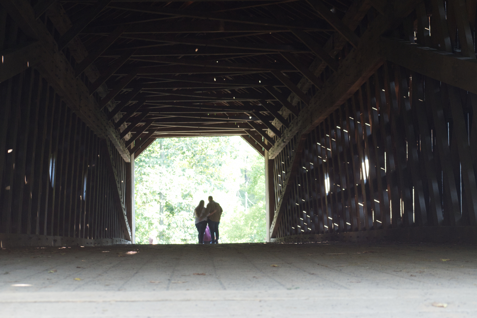
I like it, Patrick. Now we know that they are admiring the view.
Elizabeth
Well folks,
I actually don't know how I got to this image, but this is where this journey has taken me. I call it "End of Days"
Thanks for all your help and suggestions
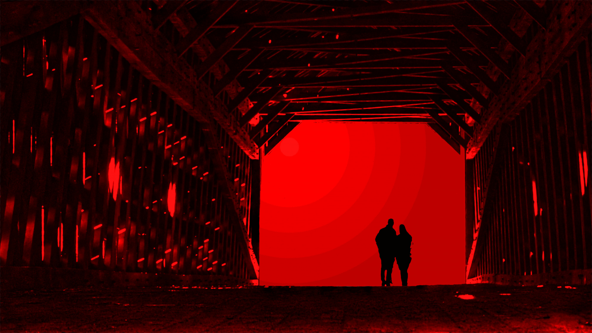
Best regards,
Patrick
I love what you did here. This is a completely different mood, concept and it transports us right there with them. I like itPatrick Compagnucci
I love what you did here. This is a completely different mood, concept and it transports us right there with them. I like itPatrick Compagnucci
Thank you Marie, your kind words are greatly appreciated.
Warmest regards,
Patrick
