|
|
|
|

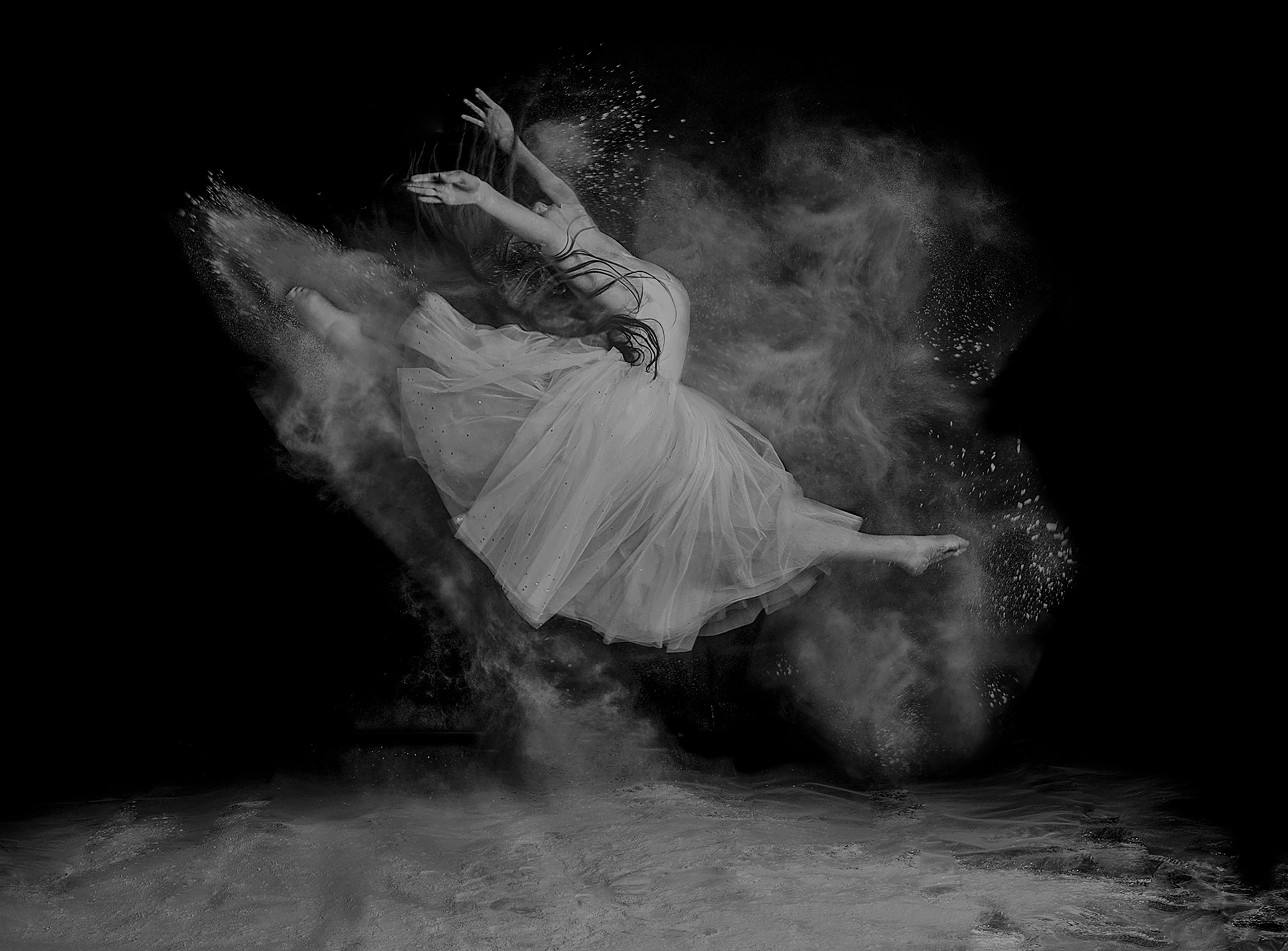
Hello experts,
Could you please review the attached image and let me know which aspects of it work poorly? Some background:
I myself had a very positive evaluation of it and was going to consider adding it to a portfolio which I'm going to present to a gallery (honestly I even imagined it getting nominated for being awarded here on 1x), but the curation results left me quite puzzled, and therefore I need your unbiased feedback. Am I going to ruin my portfolio if I include it?
How the curation process went:
I uploaded this image around 6:30 AM last Friday, which only after about 10 hours later left the "Members" curation stage with a high score of 97%. Then it took almost a full day for the "Experts" result to come out. During this time, the "Members" score dropped to 75%, and by the end of the second stage, I had 49% members score, and 52% experts -- still there was hope. Then in the last 1-2 hours waiting for the "Head" curators vote, everything dropped to 30-32%, and eventually the familiar "This photo is not selected".
What I don't quite understand is how can it be that the photo consistently maintained a decent score for nearly 36 hours, but just the last ~1.5hr changed everything completely. Anyway, that's a curation thing and those percentages are relative. How would you evaluate it in a more absolute frame?
Really appreciate your feedback.
Best regards,
Soheil

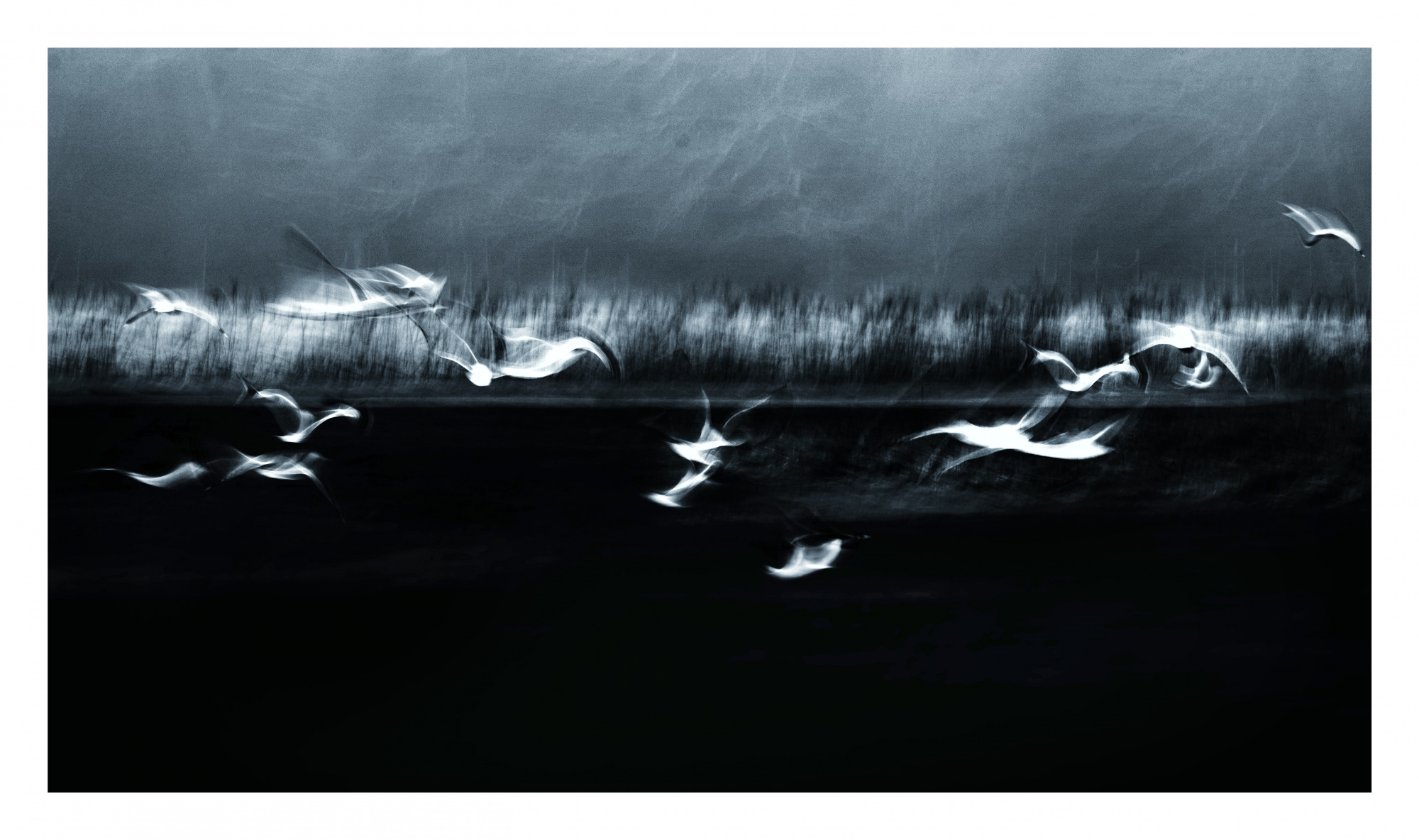
Soheil,
Thank you for sharing the photo with us in Critique Forum, and for the story of the Curation process. Yes, the percentage scores often act strangely. Many members have noticed this.
The photo is an interesting abstract/impressionistic one. I like the cold, blue tone. The title is intriguing. The motion blur and strong contrast work well together. Some highlights are clipped to pure white with no texture or detail remaining - but I think for a 'Creative Edit' image that is OK.
The border may have disqualified the photo. It's not always enforced, but in the FAQ section it's stated 'no borders, signatures, or watermarks', and the reason for that is so that the gallery will have a 'uniform and beautiful style'. Chances for Publish or Award will be better without the border.
. . . . Steven, senior critic
Hi Steven,
Many thanks for your feedback.
I was reluctant to put borders around it. The only reason why I did that was that I noticed it was almost impossible to see where the image ends on a dark-themed browser.
Thanks again for taking the time to review my work.
Best regards,
Soheil
Soheil
Thanks for submitting this image. I think it's a great image and worthy of being awarded. However, I'm not a curator so my opinion doesn't count. Curation is at its heart a very subjective process. Sometimes it goes your way; sometimes not. The numbers for member and expert curation are unfathonable. I've never been able to understand how they are determined or how to interpret them so I just ignore them. The only thing that matters if what the actuals curators think.
Steven T mentioned a possible issue with the borders. You may want to wait a few weeks to let it disappear from the collective memory of everyone involved in curation and re-submit it but without borders. There is no guarantee it will make a difference thought.
Steven also mentioned the blue toning. It certainly works. Personally, I would prefer pure black & white rather than the blue toning. This is just a personal preference. I offer this suggestion as something to consider. Go with your instincts.
Best wishes,
Mike S. - Senior Critic
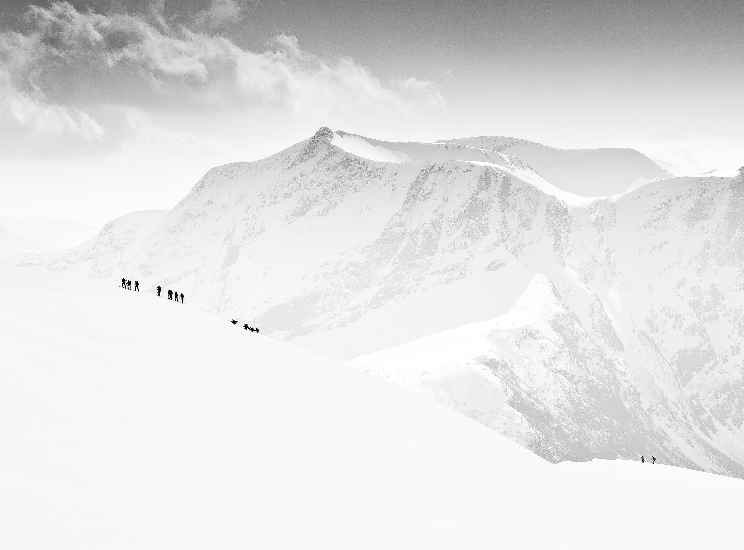
Hello experts,
Could you please review the attached image and let me know which aspects of it work poorly? Some background:
I myself had a very positive evaluation of it and was going to consider adding it to a portfolio which I'm going to present to a gallery (honestly I even imagined it getting nominated for being awarded here on 1x), but the curation results left me quite puzzled, and therefore I need your unbiased feedback. Am I going to ruin my portfolio if I include it?
How the curation process went:
I uploaded this image around 6:30 AM last Friday, which only after about 10 hours later left the "Members" curation stage with a high score of 97%. Then it took almost a full day for the "Experts" result to come out. During this time, the "Members" score dropped to 75%, and by the end of the second stage, I had 49% members score, and 52% experts -- still there was hope. Then in the last 1-2 hours waiting for the "Head" curators vote, everything dropped to 30-32%, and eventually the familiar "This photo is not selected".
What I don't quite understand is how can it be that the photo consistently maintained a decent score for nearly 36 hours, but just the last ~1.5hr changed everything completely. Anyway, that's a curation thing and those percentages are relative. How would you evaluate it in a more absolute frame?
Really appreciate your feedback.
Best regards,
Soheil
Strengths First:
• The ethereal, abstract mood is strong.
• The motion blur gives the birds a dreamlike quality.
• The darker tonal palette creates a nice emotional weight.
• Compositionally, the birds are well placed, leading the eye across the frame naturally.
⸻
Areas to Improve:
1. Midtones and Detail:
• The image feels a bit too muddy between the highlights (birds) and the blacks (background).
• Consider raising the midtones slightly or doing selective dodging to lift just a little more detail in the background. It would help separate the birds from the background even more without losing the mood.
2. Texture vs. Flatness:
• The background field and sky have a smeared texture — while this suits the dreamy mood, it could benefit from subtle texture recovery (like clarity or structure just in those areas).
• Otherwise, parts of the image risk looking unintentionally flat rather than intentionally abstract.
3. Bird Highlight Control:
• Some birds (especially top-left in the second image) are over-bright compared to the rest.
• Consider slightly pulling back highlights on the brightest birds so that the eye flows more smoothly across the image instead of getting “stuck” on a couple of hotspots.
4. Aspect Ratio Choice:
• The crop is wide, which fits the flight motion nicely, but there is a lot of negative space in the bottom.
• You might experiment with cropping a little from the bottom to bring the birds slightly lower in the frame — giving the image a bit more upward lift, which could complement the feeling of them taking flight.
5. Narrative and Emotional Pull:
• Abstract photos still tell a story. Right now it feels a little emotionally distant — almost clinical.
• If you adjusted the contrast slightly (soften the edges more or make the background more dramatic with dodging and burning), you could draw out a stronger emotional narrative — peacefulness, escape, storm brewing, etc.
