|
|
|
|
Dear friends,
Thank you for allowing me to post my picture here to receive your critique. I look forward to hearing your views and to learn from you!
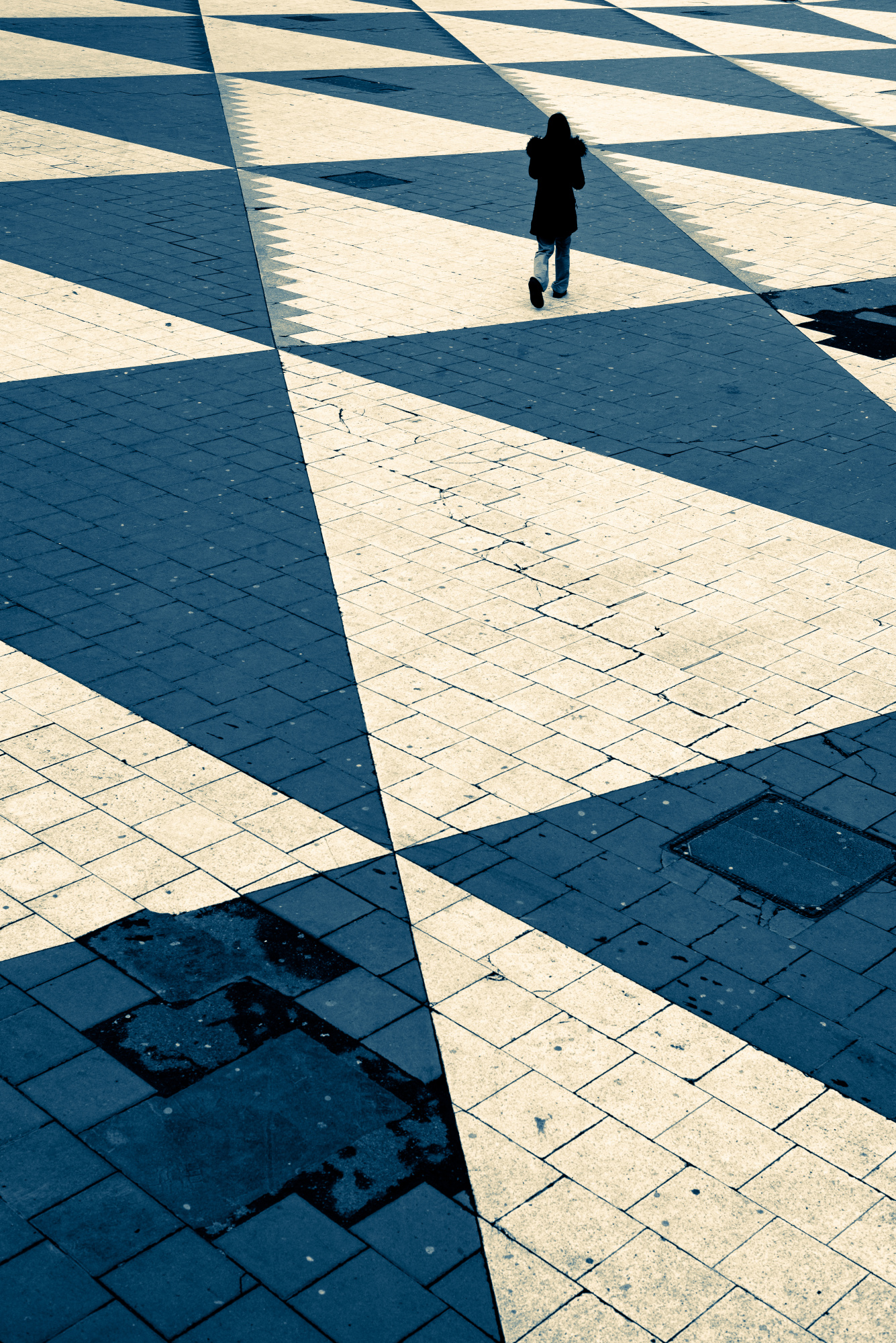
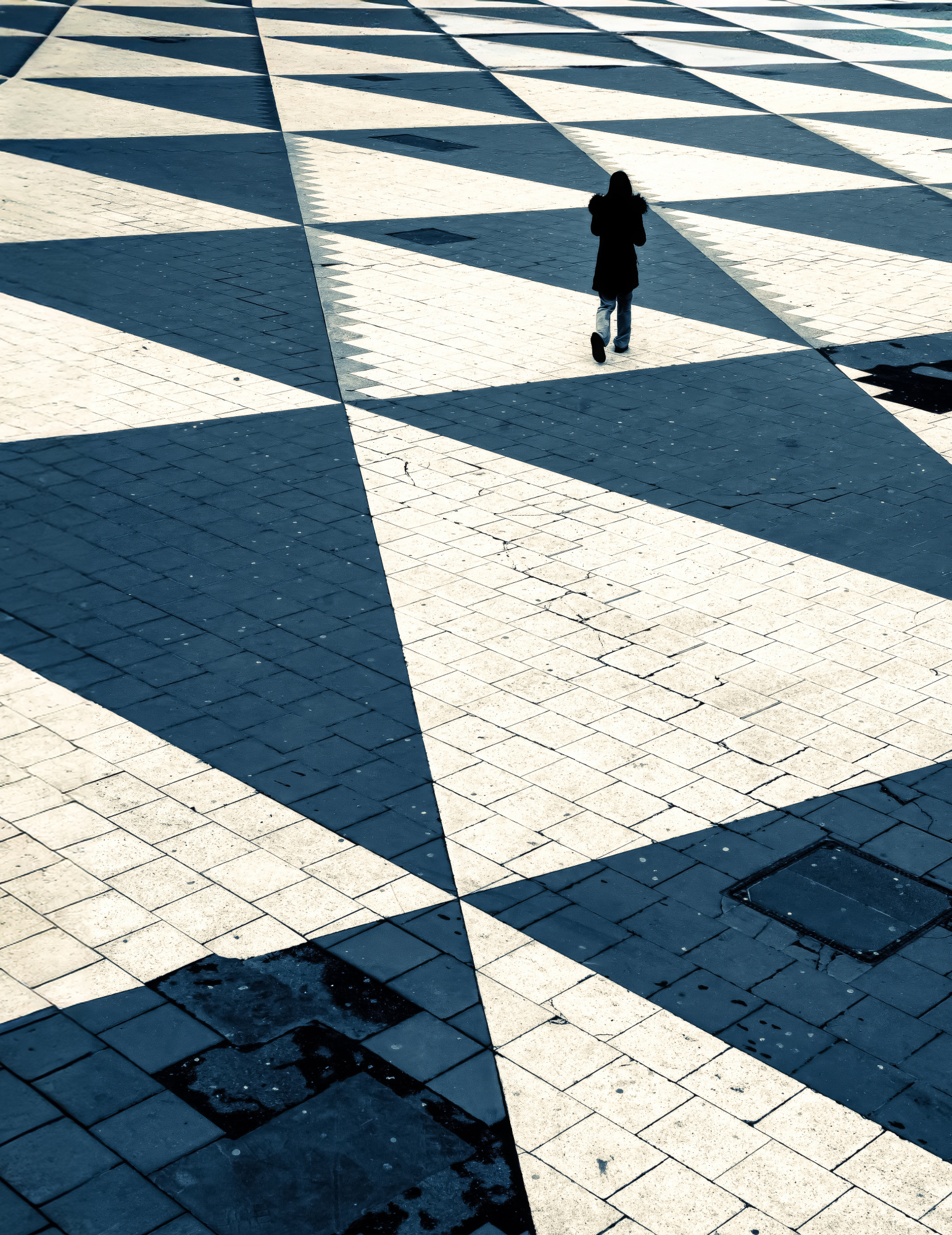
I like street photography, and I took this picture in the morning on a grey day in the central parts of Stockholm. I like to include strangers in my street images, and in this composition I found the lady crossing the square interesting, because of the way she moved against the pattern on the ground. I tried to compose the shot so that she would not be in the centre of the image, and to include as much as possinble of the foreground. I tried to capture her walking on one of the white triangles (given the dark outfit she was wearing.
Shooting with a prime lens, I tried to position myself relatively close to the subject matter, but slightly from above to be able to position the subject in relation to the diminishing lines of the foreground. Furthermore, the light conditions were relatively good so I had a relatively fast shutter speed (1/500 s) and a relatively low ISO value (160), and I shot at f/8 to try to hit the sweet spot of my lens (more technical details listed below).
In post processing, I increased the contrasts and I opened up the shadows a bit while giving them a more blue-ish tone. However, I also tried to contrast that by making the highlights a little bit warmer. Due to the grey weather, I felt that it would improve the picture if I made it black and white, so I tried to reinforce the sombre and gloomy mood by desturizing it.
I chose the title "Checkmate" due to the gloomy vibe, and in particular due to the patterns on the square with the subject matter crossing it.
In the curation process, I had a fairly good popularity (50% more popular according to the members, and 19% more popular according to the expert curators). I have had images published and awarded on 1x with both higher and lower ratings. The publication decision is however not the reason why I am posting this picture in this forum. I am more interested in how I could improve as a photographer. :)
Many thanks for your attention, and many thanks in advance for any feedback. I look forward to learning from you!
Kind regards,
Siamak
Camera: Nikon D750
Lens: Nikkor 50 mm f/1.4
Focal length: 50 mm (obviously)
Shutter speed: 1/500 s
Aperture: f/8
ISO: 160
Exposure compensation: None
Filter: Polarizing filter
Tripod: None
Post-processing: Adobe Lightroom

Hello Siamak
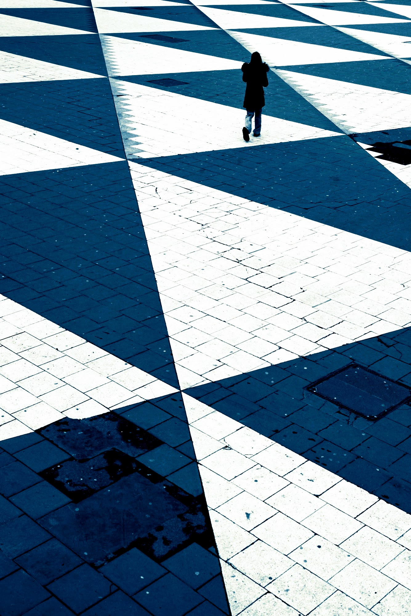
Thank you for sharing your Checkmate photo with us. You have an impressive gallery, and I personally like the Checkmate photo very much. However, I can imagine that others may find the foreground too deep and the imperfections unappealing, while the lack of definition in the white paving stones is in all likelihood a weakness. I do find the dark paving stones on the right side distracting, so I am posting a darker edit to try to reduce that distraction somewhat. The second edit I'm posting is a substantial crop with lighter colours and some sharpening that might also be worth considering.
Good light, Elizabeth

Dear Siamak,
Thanks for submitting your photo to the critique forum.
It is an interesting moody image, however, in my view, it needs some adjustments to improve its overall look.
The photo would benefit from better proportions. So, I took it to Photoshop Beta and added a bit of new area on the left and on the top of the image, using Beta’s content aware tool. I also cropped the bottom, all in order to follow (within limits) the rule of thirds.
I also reduced the intensity of the blue triangles. Finally, I took it to Topaz AI to increase the sharpness and reduce the noise.
Hope it will be of help.
Best regards
Arnon Orbach Senior Critic
Hello Siamak
Thank you for sharing your Checkmate photo with us. You have an impressive gallery, and I personally like the Checkmate photo very much. However, I can imagine that others may find the foreground too deep and the imperfections unappealing, while the lack of definition in the white paving stones is in all likelihood a weakness. I do find the dark paving stones on the right side distracting, so I am posting a darker edit to try to reduce that distraction somewhat. The second edit I'm posting is a substantial crop with lighter colours and some sharpening that might also be worth considering.
Good light, Elizabeth
Dear Siamak,
Thanks for submitting your photo to the critique forum.
It is an interesting moody image, however, in my view, it needs some adjustments to improve its overall look.
The photo would benefit from better proportions. So, I took it to Photoshop Beta and added a bit of new area on the left and on the top of the image, using Beta’s content aware tool. I also cropped the bottom, all in order to follow (within limits) the rule of thirds.
I also reduced the intensity of the blue triangles. Finally, I took it to Topaz AI to increase the sharpness and reduce the noise.
Hope it will be of help.
Best regards
Arnon Orbach Senior Critic
Many thanks for your feedback and for taking the time. Much appreciated!
