|
|
|
|
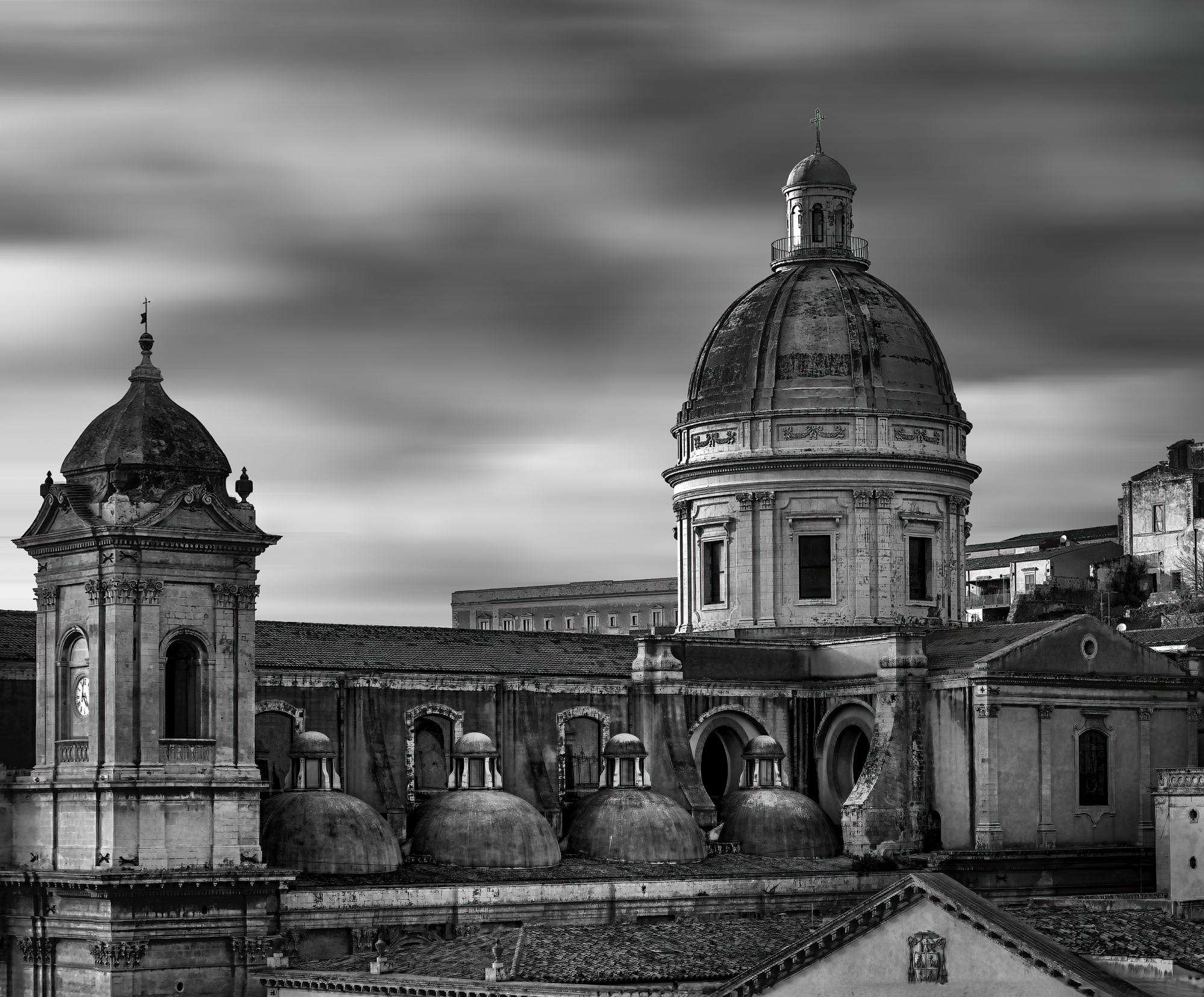
The dome of the Cathedral of San Nicolò in Noto is an architectural element that embodies majesty and beauty. Positioned above the transept, it is characterized by an imposing and classical form, typical of the Baroque style.
Unfortunately, the original dome collapsed during the devastating earthquake of 1996, along with other parts of the cathedral. However, thanks to an ambitious restoration project, the dome was rebuilt and restored to its former splendor. Today, it stands as a symbol of resilience and renewal for the city of Noto.
The current structure combines fidelity to the original design with modern elements that ensure its stability and durability over time. When the light hits it, especially at sunset, the dome glows magnificently, creating an unforgettable scenic effect.
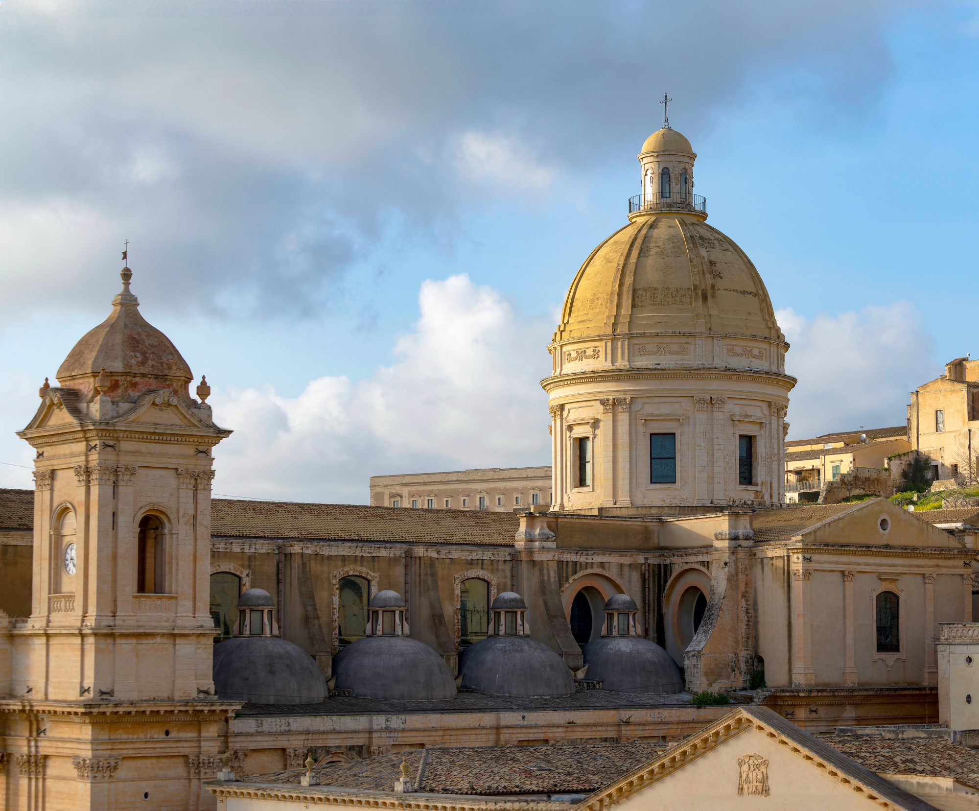
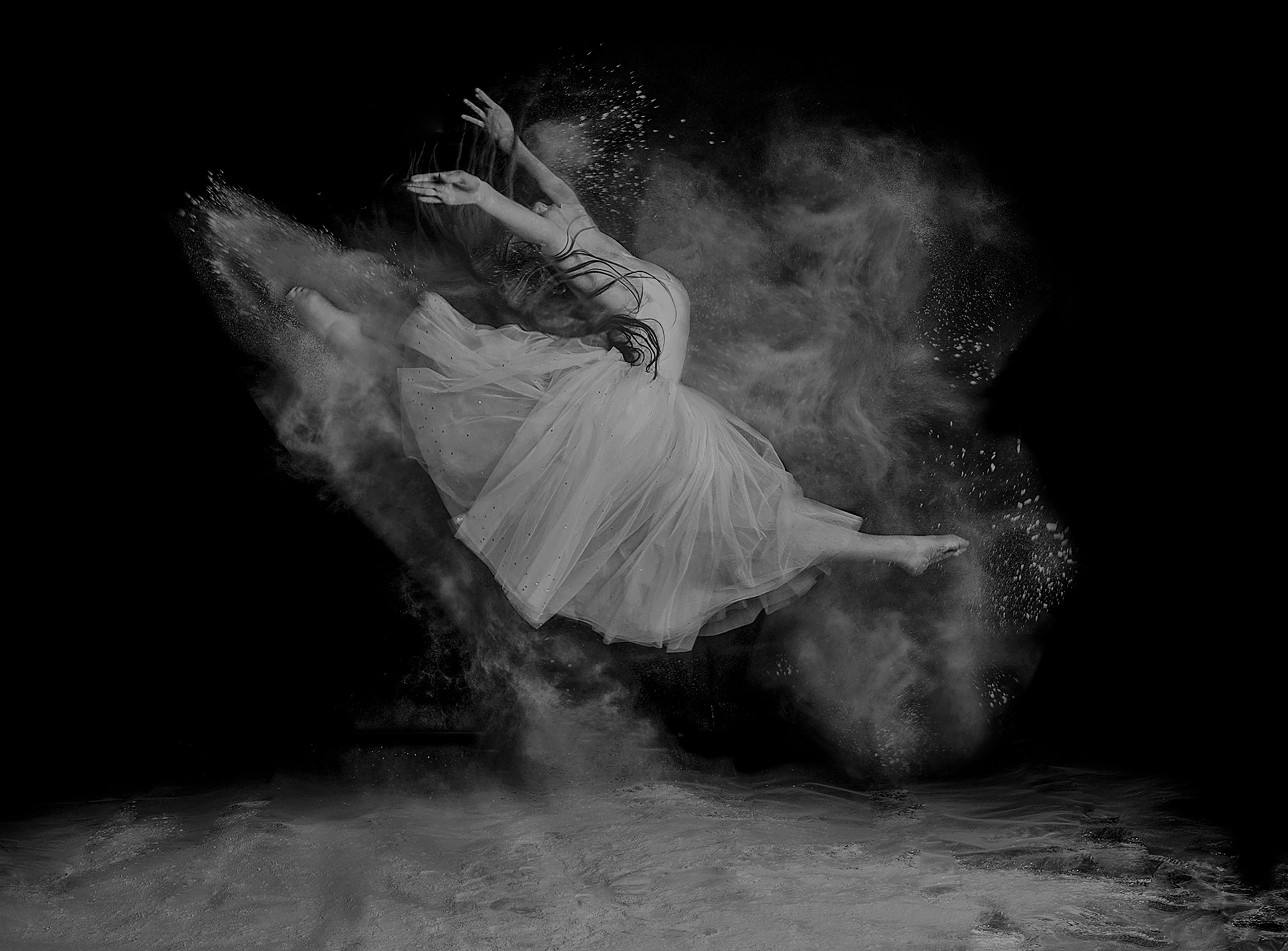
"I wanted to get your opinion on this photo, first of all regarding the composition. Then, I’m uncertain about converting it to black and white... I’m not sure if it works better in color or monochrome. What do you think?"
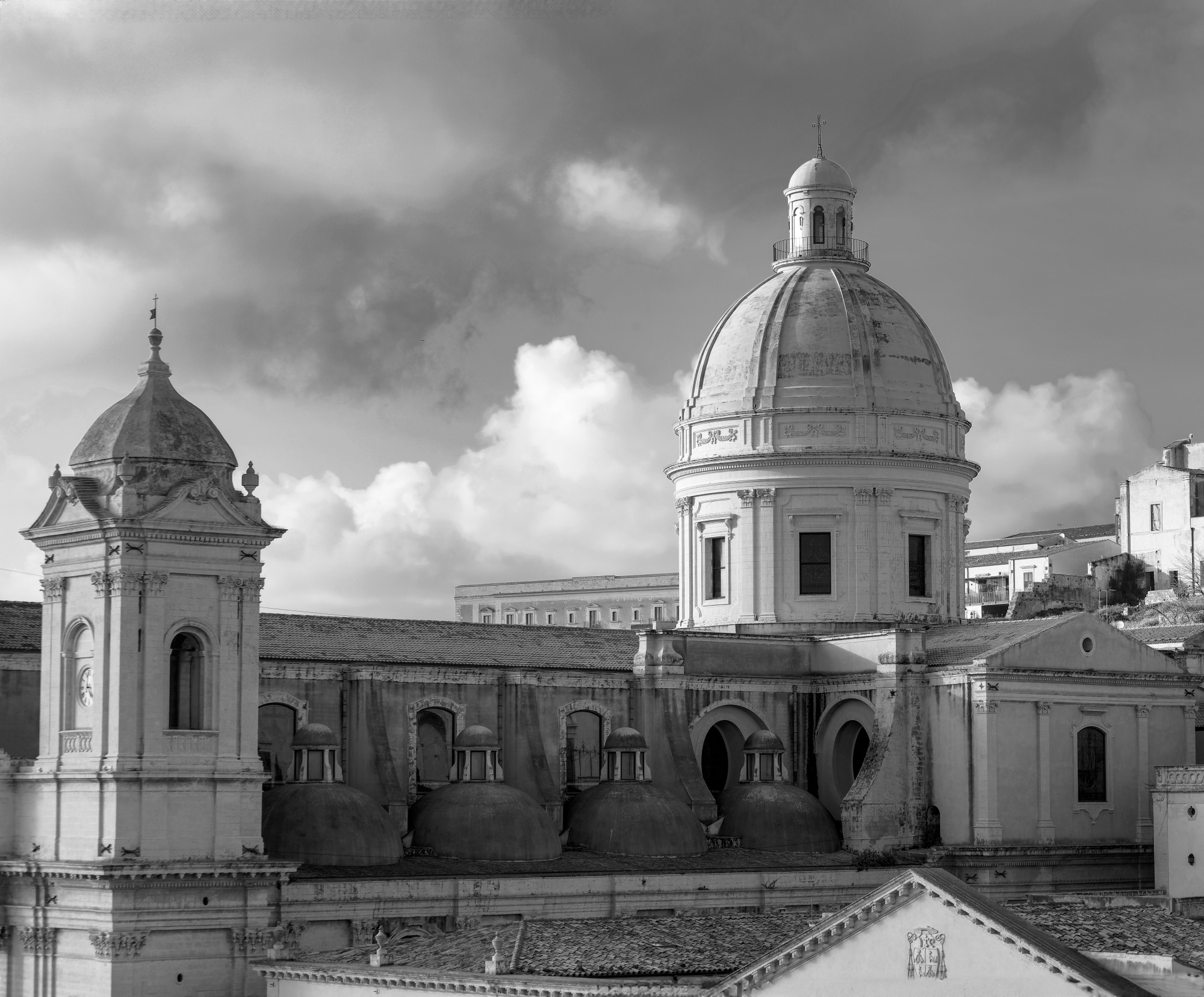
Hi and welcome back looking It's an ok image I just don't fel the power of this wonderful building and it sould stand proud amd majestic I think the problem could be the sky and I would consider replacing it if this was my image. I did try a few things back in Photoshop but still not happy with the results - I try monochrome" Full Spectrum " Straightened the uprights and blurred the sky this was done on the quick more time better the detail.
"Good morning Daniel, I really like the work you did on the photo. I wonder what else I could do to make it even more impactful. Maybe I could make the sky a bit more dramatic? What do you think? What advice would you give me? Thank you in advance!
Hello Corrado
Thank you for sharing this architectural photo with us. The light and details are good against the cloudy sky, but I am suggesting a closer crop where I have increased the definition. I have worked on the black-and-white version but I'm not sure that it's better than the colour. I can't really say how well it will do in curation as the bar seems to be very high at the moment. Wait and see if there are other opinions.
Good light, Elizabeth
PS - So sorry - I edited this yesterday but realised that it hadn't actually been posted.
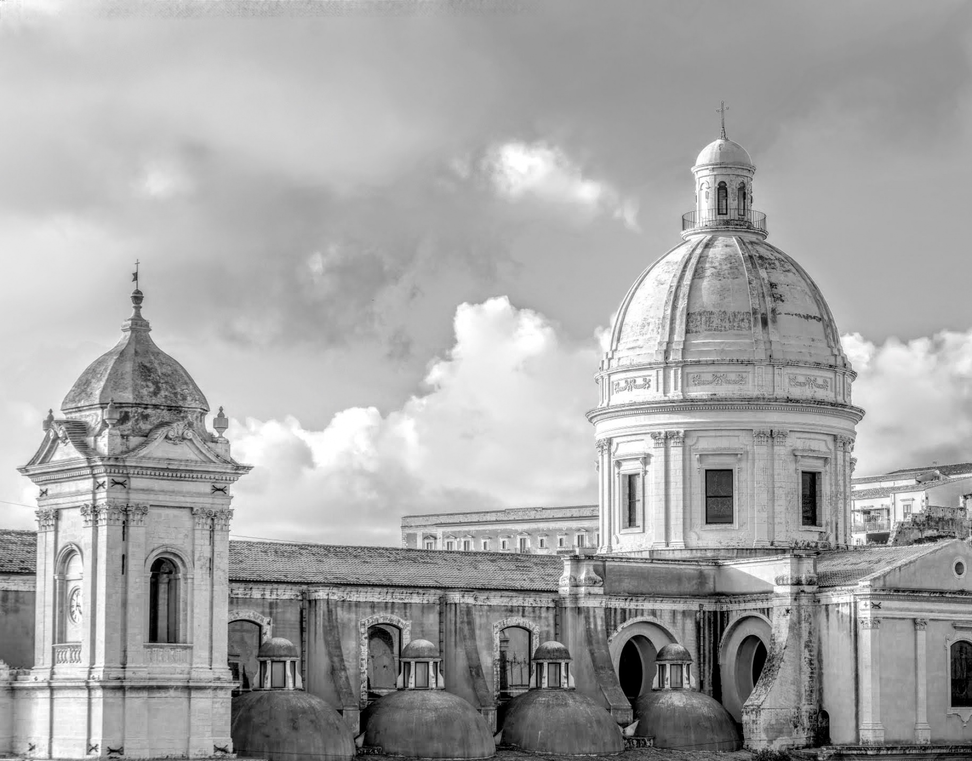
Hi each image no matter what subject has limits when it come to improvements. We are all here to help the best we can. I do like the contrast I've introduced but the sky could look better. I feel I've reached my limits with your image. Others may have better ideas.
