|
|
|
|

Hello,
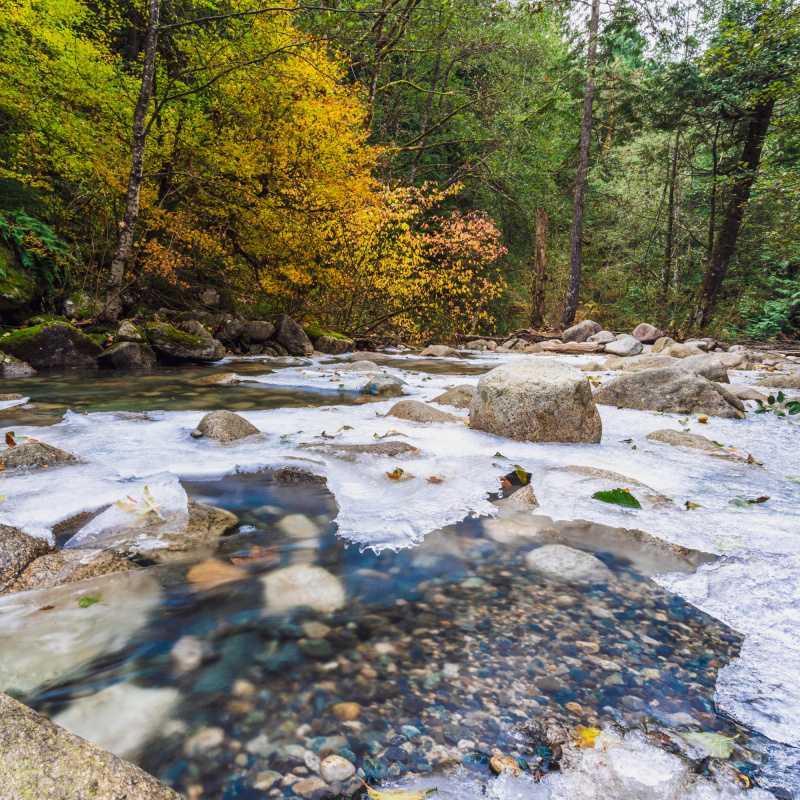
In this image, I was hoping to capture the transition from autumn to winter with the fall foliage and the partially frozen river. Would appreciate your feedback on the overall quality of the image and whether the message is effectively communicated. Any suggestions for improving the image? Thank you very much.
17mm
f/18
2sec
50 ISO

Hi Sharon welcome back - I will jump right in. - MNy first impression was not good I thought it lacked impact in all departments. - No great light to speak of. So I took your fine image back into Photoshop - I could see the whites of the ice lacking detail so I turned the whites slider right down - Dehaze +30 to add colour and contrast. - Saturation +17 - Nik Tools Tonal Contrast and Indian summer to give texture and extra colour. - With no great light I took the burn tool and tried to add mood to the ice and shoreline. - Last I worked on the blown whites in the ice with fill content aware and the clone tool - As an after thought I did crop the bottom then took a bite out of the whole image see attached.
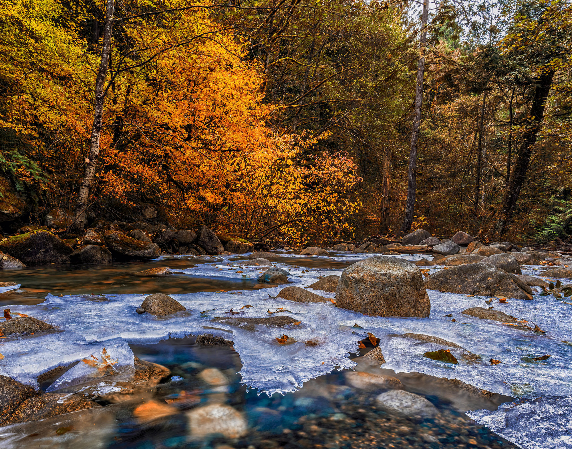
bite taken out of full frame
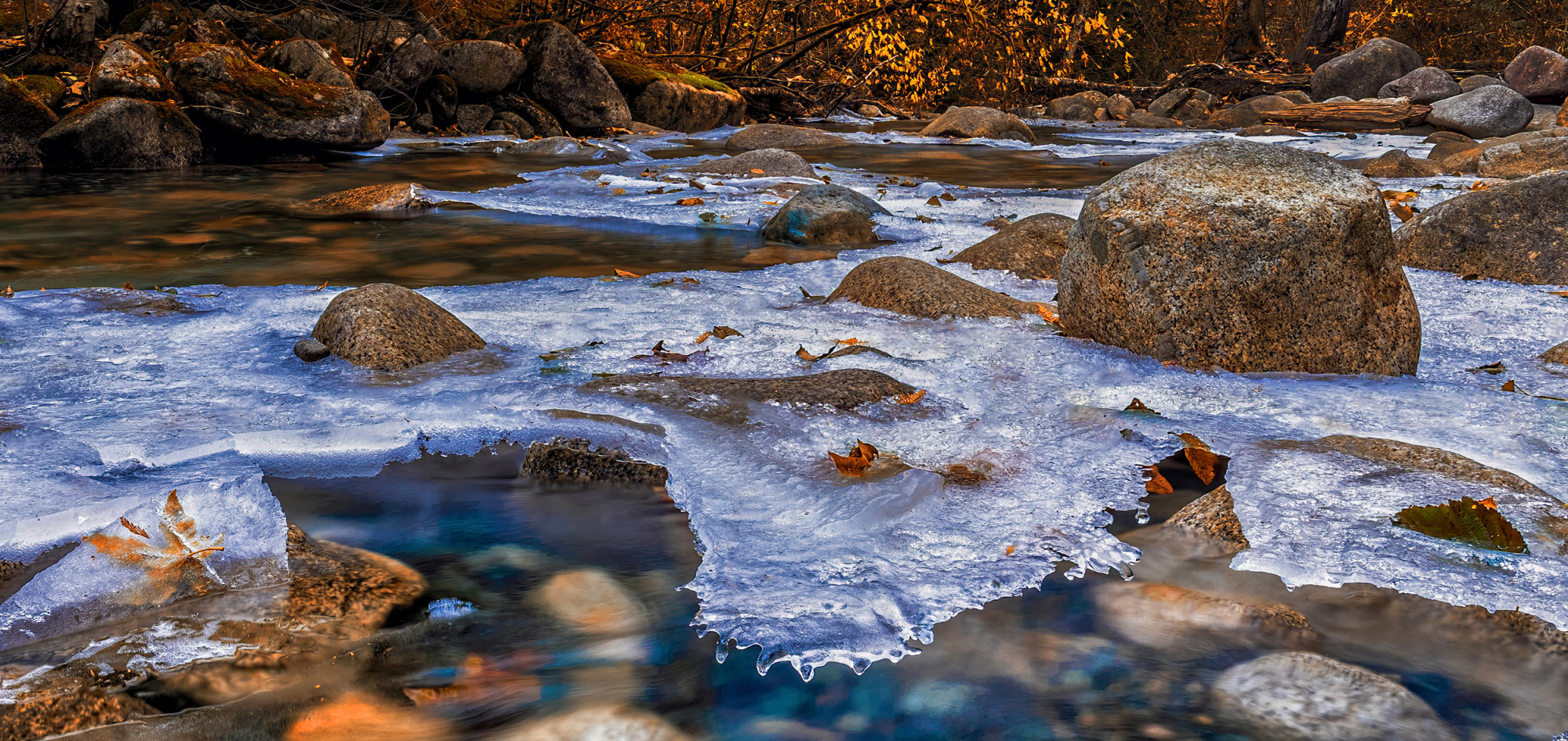
Hi Sharon welcome back - I will jump right in. - MNy first impression was not good I thought it lacked impact in all departments. - No great light to speak of. So I took your fine image back into Photoshop - I could see the whites of the ice lacking detail so I turned the whites slider right down - Dehaze +30 to add colour and contrast. - Saturation +17 - Nik Tools Tonal Contrast and Indian summer to give texture and extra colour. - With no great light I took the burn tool and tried to add mood to the ice and shoreline. - Last I worked on the blown whites in the ice with fill content aware and the clone tool - As an after thought I did crop the bottom then took a bite out of the whole image see attached.
bite taken out of full frame
Thanks Daniel for your honest feedback. I agree that the image lacks a clear focal point and impact.
I am blown away by your editing wizardry! I love how you brought out so much detail in the ice! I've been intimidated by photoshop so I've been editing all my images exclusively in Lightroom. But, after seeing what you can do in photoshop, I am motivated to buckle down and learn the program.
