|
|
|
|
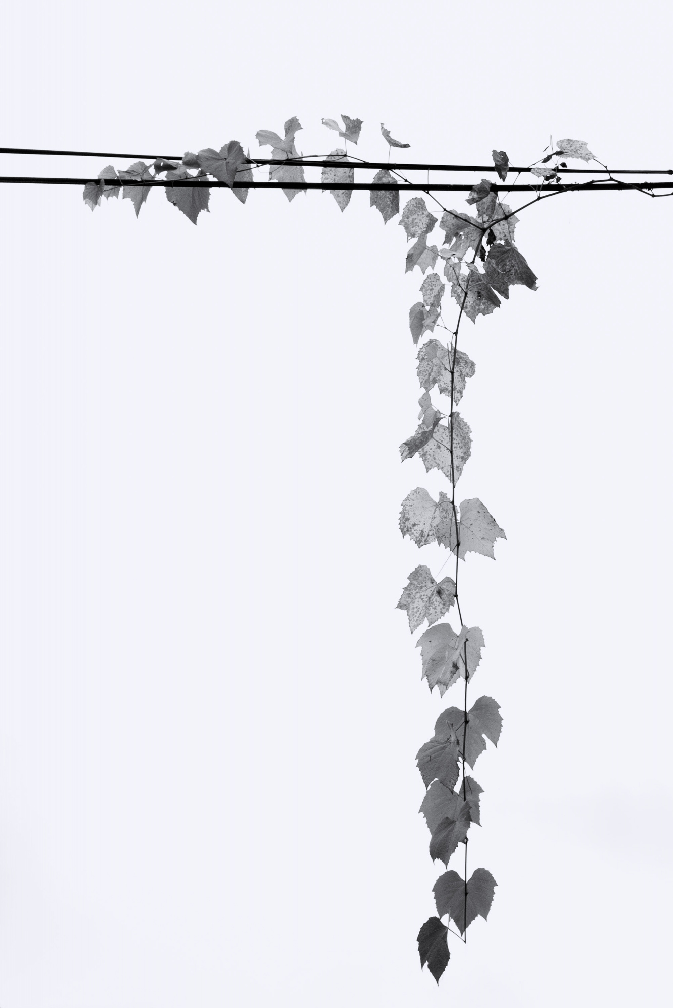
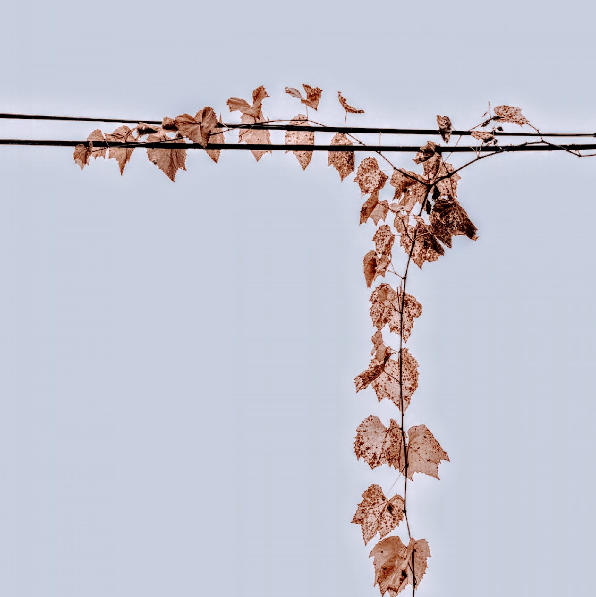
I took this shot in a small lane in Ljubljana. I was attracted to the simple lines and the potential in black and white. (The colour of the leaves were quite washed out and not of much interest to me). I used Lightroom and Photoshop for processing. ISO 100 / Focal length 37 mm / F14 / 1/200 sec. In hindisight, I am not sure why I chose F14 and not a wider one. My question is how I could improve this. I feel there could be more punch in the image. Any suggestions / criticisms would be appreciated.
Brian,
Points for 'Originality'! Autumn leaves are a favourite subject, but you have a different take on them here.
There could be a theme of 'Man vs Nature' for viewers who look for meaning, or just the shapes and forms as an abstraction. Either way, and interesting photograph. Thank you for sharing it with us here in Critique Forum.
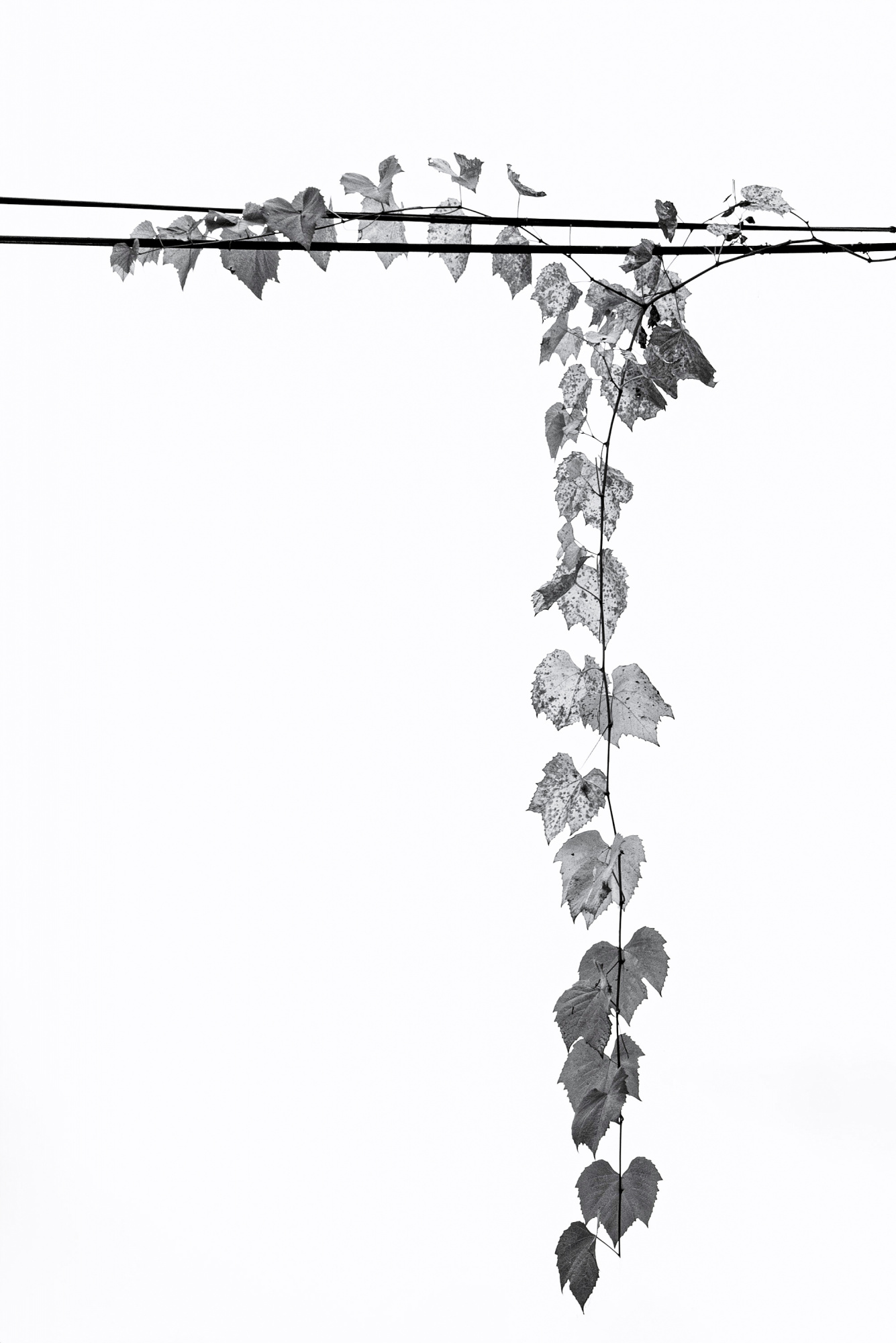
You wrote that there could be more 'punch' in the image. One way to give it a bit more impact would be the Texture, Clarity, and DeHaze sliders in Photoshop's 'Filter>Camera Raw Filter>Effects'. A side effect of using those sliders is that the contrast goes up and the image becomes darker, but the overall tone can be restored with the Exposure slider in that same filter.
I tried from a screen capture to add some punch. As an experiment I also tried the Colorize option of 'Filter>Neural Filters'. Since the image has that 'abstract' quality I thought some subtle, abstract colour might work.
Just ideas . . . . that's what we do here. It's best if the photographer decide on composition and editing for the theme and purpose of the photo.
. . . . . Steven, senior critic
Hello Brian
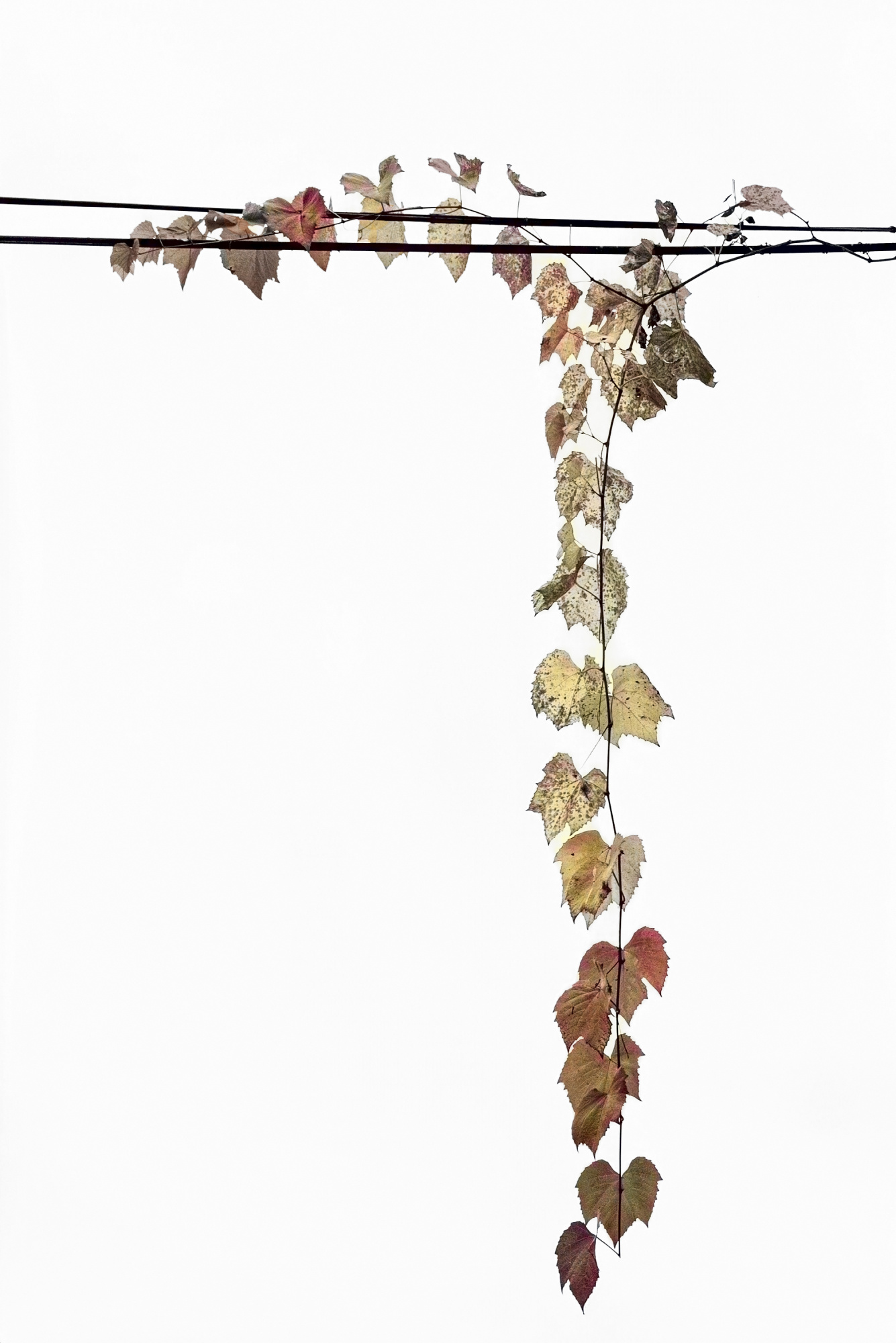
Thank you for sharing your Autumn Leaves photo with us, which is so poetic. Steven's edit's are excellent, and although you seem set on black and white, I am posting a version with some colour added (but not as beautiful as Steven's). I have also made a square format which may not appeal to you as the long, trailing leaves are wonderful, but there is so much negative space that I wanted to try a different crop.
Good light, Elizabeth
Thank you, both
Much appreciated. I had dismissed colour as an option but both of your suggested colour alternatives are really interesting and I will explore that option. (I have recently stumbled across neural filters for a panel I am working on, so it will be interesting to go reviisit it). On B&W, I will play with the texture / clarity / dehaze sliders and see what happens.
Again, my thanks to both of you for taking the time.
Brian
