|
|
|
|
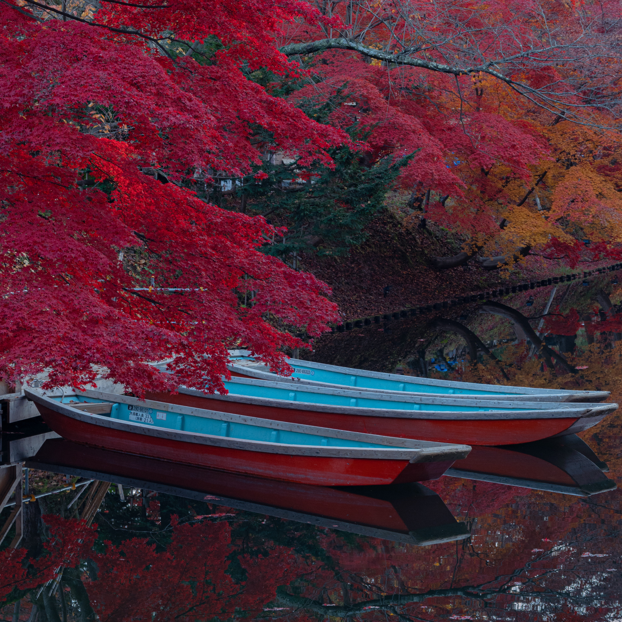
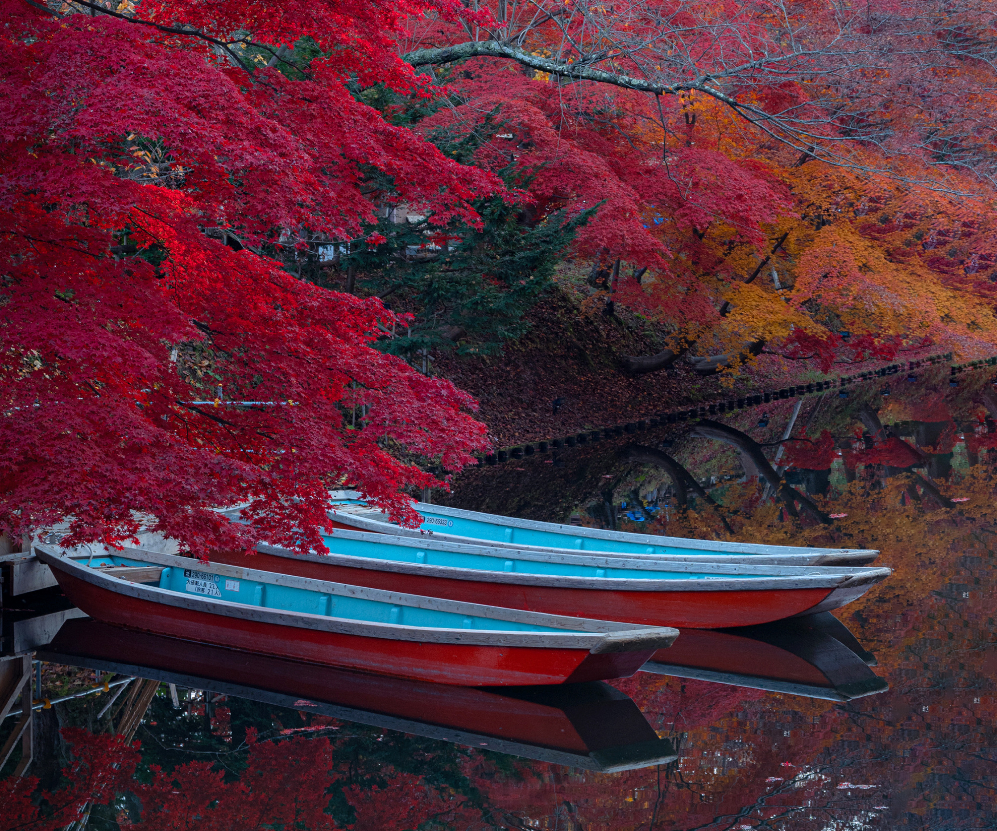
I wanted people to see the beauty of red, which is unique to autumn. The sun was shining on the surface of the water, creating a beautiful reflection, and there was a cute little red boat, so I wanted to somehow make it a collaboration.
I also wanted to express the slightly cool and clear autumn air.
The composition was centered so that the reflection and the autumn leaves above would be divided into two halves and the boat would be the subject.
The focal length was 72mm, but I used a 1/50 second exposure with image stabilization and a histogram to ensure proper exposure.
The highlights were lowered in Lightroom to create a nice reflection. Increased the saturation of red and orange in the color mixer to emphasize the red of the autumn leaves. I always lower the brightness and raise the texture. The original image had strong reflections in the lower right corner, so I cropped it to 1x1 so as to crop that area.
I would like to ask if the composition is correct, what is your first impression, do you feel the autumn atmosphere?
Hello Kaho Hasegawa and welcome to the Critique Forum and to 1X !
I really like your image of these boats under gorgeous Japanese maples. I live in Canada where we are known for our beautiful fall colours but after visiting Japan, I think that maybe your fall colours are even better !!! I hope to return to Japan next year maybe to enjoy the fall foliage once again.
Meanwhile, let me get back to your image...
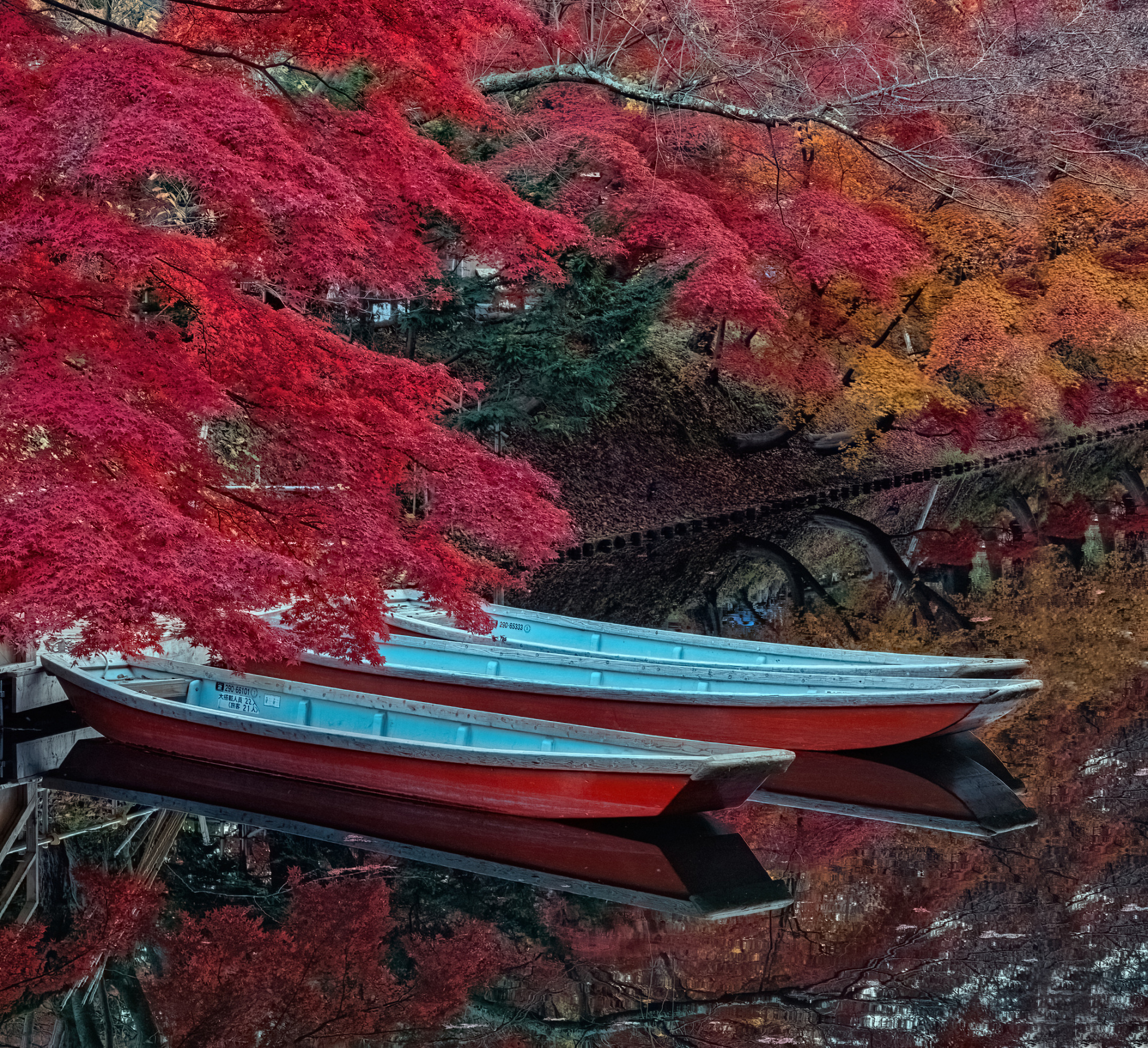
I like the scene you captured but for me the crop on the right is too tight, too close to the boats. I wonder if your original image was captured in a wider format (4x6 maybe?). If so, you could work with that original image and give some room in front of the boats.
Since I did not have that image, I added a little bit of room on the right by increasing the canvas size in Photoshop Elements 20 and I filled the added canvas space created by using the Fill section / Content aware option. The result did not match the shore well so I had to physically move it to match the shore line. I did this quickly just to give you a sense of what you can do.
It would be much better if you had the original image in a wider format to work from.
Then, I imported your image in Nik color Efex pro and used the Details Enhancer filter to slightly increase the details. I also used a Skylight filter (lightly) and the Tonal Contrast filter to increase contrast.
Back in PSE20, I adjusted the levels and decrease a little bit the saturation of some of the red leaves that were too bright.
Then I used Topaz Denoise Ai to decrease the noise.
I am posting below what I did and you will see that the format is not standard. That's because I just added room on the right and did not want to crop top and bottom because I liked the long tree branch and its reflection. But we can change the format as you please.
All of the above comments are simply suggestions for you that might help you discover new processing techniques and formatting/cropping options as well as to see what else can be done with your image. But ultimately it is your image and your vision that matter.
I hope this is helpful to you.
Best of luck
Lucie s.c.
Kaho,
I like the suggestion of Lucie, but on two points I have another idea. I like your darker colours more and I removed an in my eyes disturbing part below.I also used content aware on the right in Photoshop. Below my suggestion. Theo L.