|
|
|
|
Hi all,
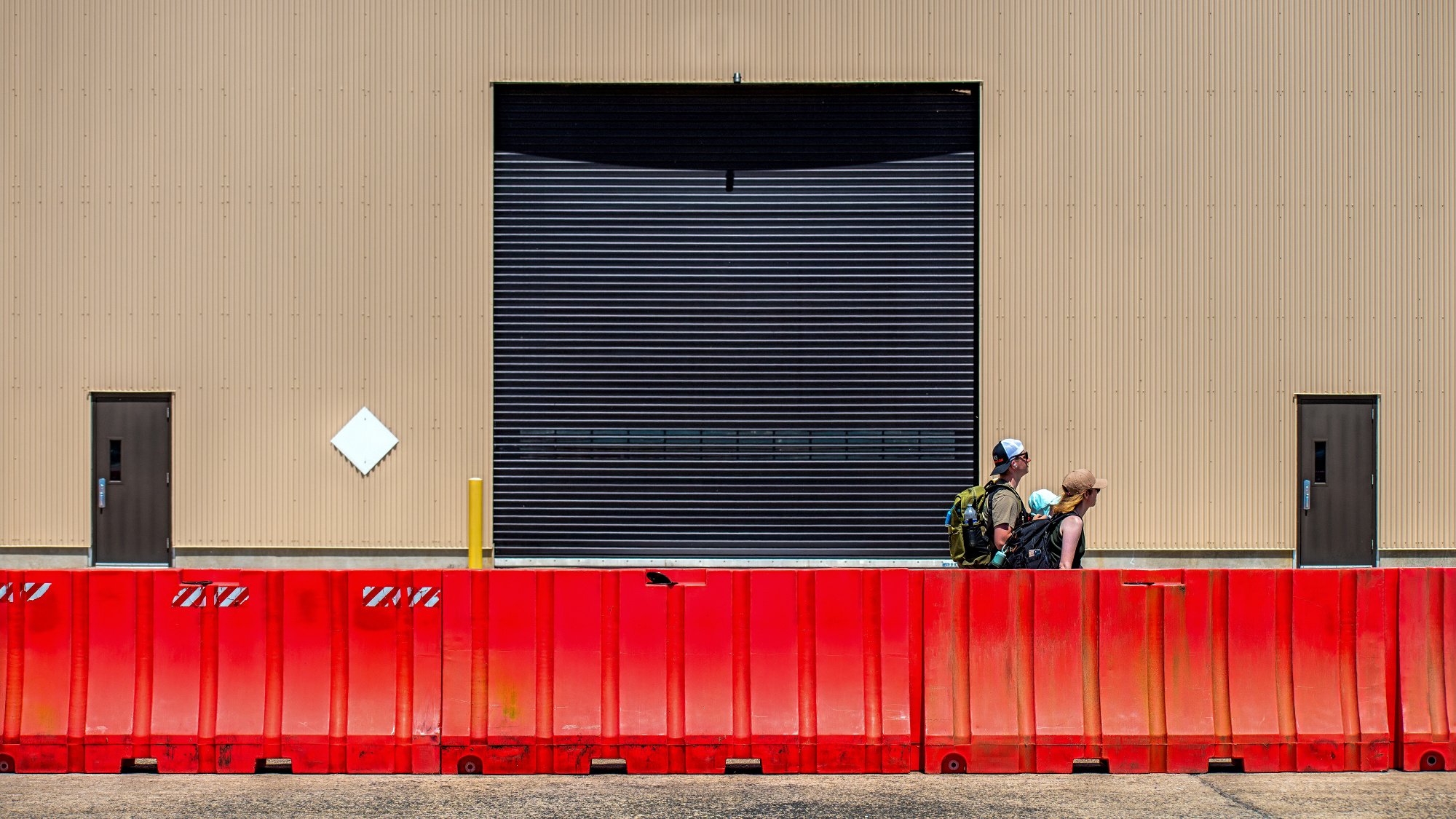
I took this at an airshow last week. I guess you might call it a compositinal study with people and building. I like it for it's simplicity and geometry. I was wondering what you all think, and if there any ideas for improvement?
FL70, F7.1, Exp 1/800, ISO 200. Photoshop 2025.
Thanks for your comments.
Patrick
Dear Patrick,
Welcome back. Always good to have you here. Looking at the photo,
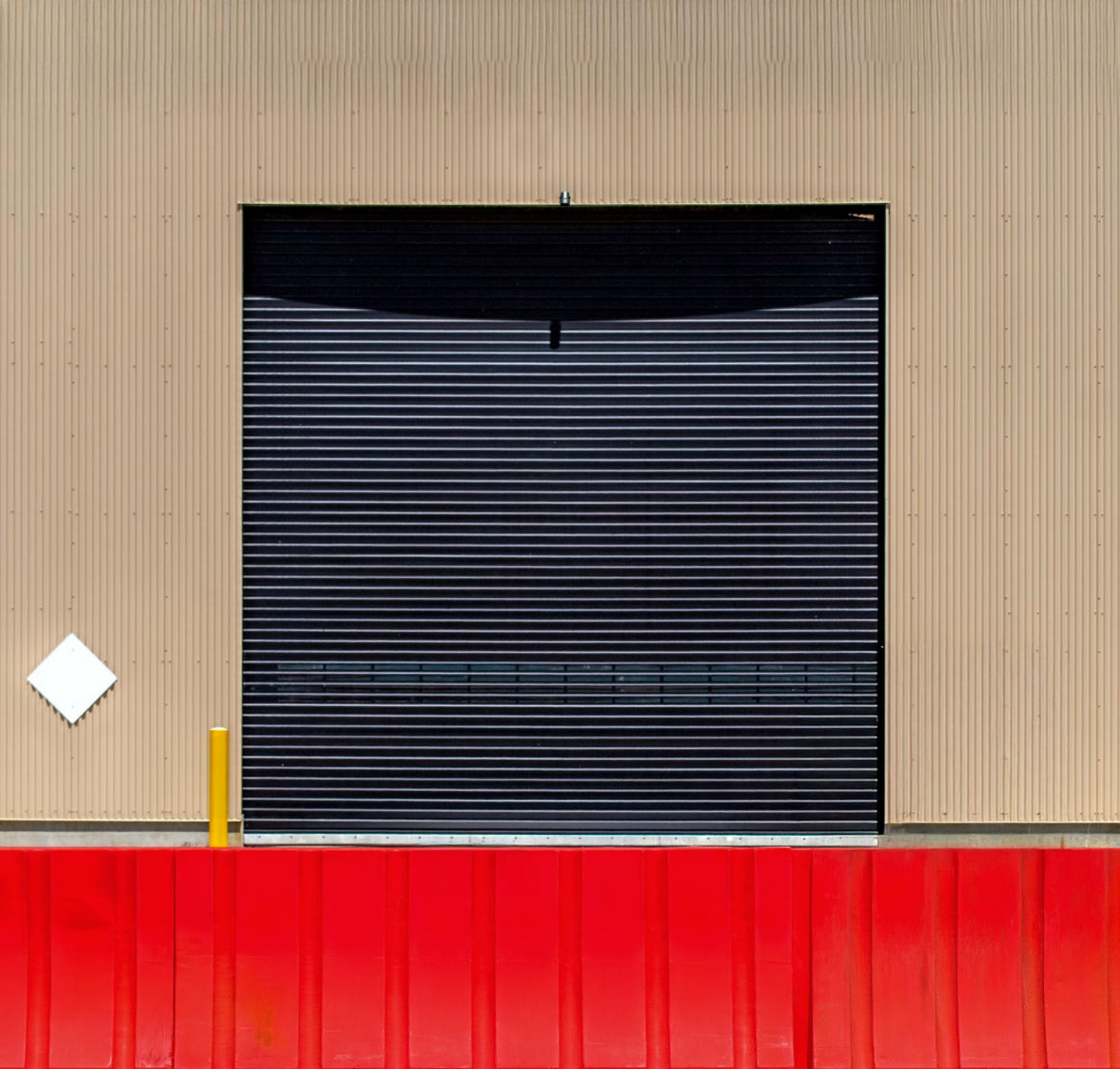
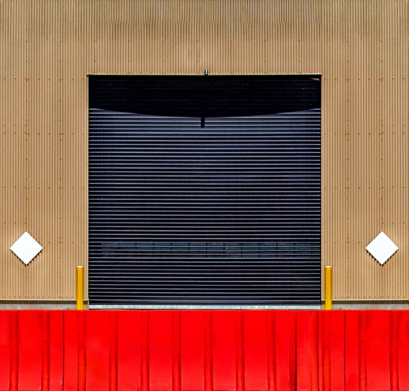
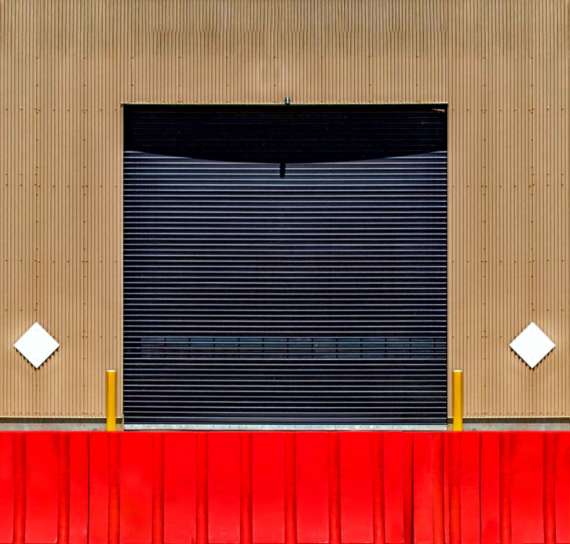
I personally do not see what they add to the photo, they seem like tourists walking by with no relation to the place, on the way out. The façade has a nice graphics element like the yellow column and the white rhombus, the red “fence” the nice big opening in the center. I cropped your photo to give it a more graphic look than street scenery. I also have one version with the people and one without. It is only my initial reaction; I hope you will get more ideas to look at.
Kind regards
Arnon
S.C.
Patrick,
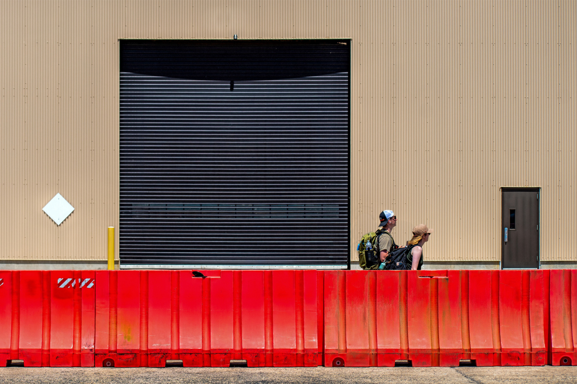
Just a quick comment. I always look for meaning in a photograph. Here I see a young family dressed for hiking with backpacks and water bottles - but they are hiking through a colourful yet bleak, man-made environment without a tree, stream, meadow, or mountain in sight. That seems like a theme. I like the title ♫And Baby Makes Three♫, but something like 'Nature Walk', or 'The Future' might lead viewers to think about the juxtaposition of subjects and background representing our disassociation with ol' Mother Nature. Just an idea.
. . . . Steven, senior critic
Hi all,
I took this at an airshow last week. I guess you might call it a compositinal study with people and building. I like it for it's simplicity and geometry. I was wondering what you all think, and if there any ideas for improvement?
FL70, F7.1, Exp 1/800, ISO 200. Photoshop 2025.
Thanks for your comments.
Patrick
Hello Patrick!
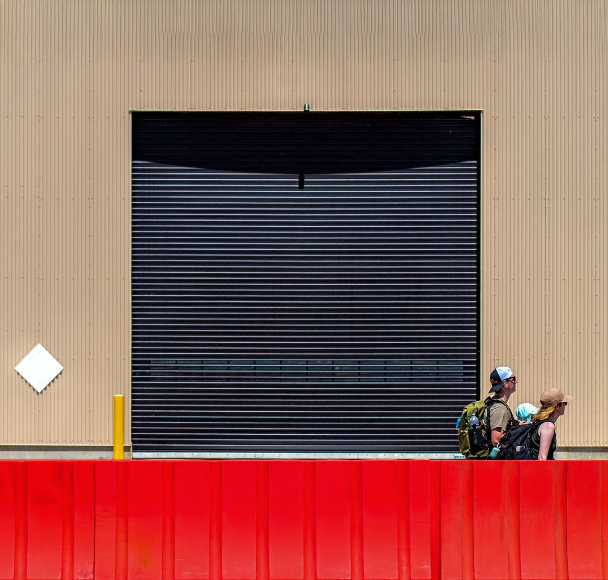
Glad to see one of your photos here again! I agree with what Arnon Orbach said about the tourists seeming out of place, so I hope that Arnon won't mind that I am offering you a suggestion starting with his version.
So what I added to his version was that I added some symmetry by copying the post and triangle section from the left to the right, then inverting it.
Then I did minimal touch up, dehazing the image a little in Photoshop, increasing contrasts in Nik Color Efex Pro (Tonal Contrast), and then reducing hightlights mostly on the red section in Photoshop.
Then I cleaned up the red because it has lots of marks so if you were to go with a more geometric version like Arnon and I suggested, the red section should be cleaner in my opinion. A lot of images in that style on 1X are spotless clean. So that is something to consider.
I hope this version I am presenting is helpful to you. (See photos in post below).
Take care.
Lucie, s.c.
Hi all,
I took this at an airshow last week. I guess you might call it a compositinal study with people and building. I like it for it's simplicity and geometry. I was wondering what you all think, and if there any ideas for improvement?
FL70, F7.1, Exp 1/800, ISO 200. Photoshop 2025.
Thanks for your comments.
Patrick
Here are the photos... They did not upload properly the first time!!!
Dear Patrick,
Welcome back. Always good to have you here. Looking at the photo,
I personally do not see what they add to the photo, they seem like tourists walking by with no relation to the place, on the way out. The façade has a nice graphics element like the yellow column and the white rhombus, the red “fence” the nice big opening in the center. I cropped your photo to give it a more graphic look than street scenery. I also have one version with the people and one without. It is only my initial reaction; I hope you will get more ideas to look at.
Kind regards
Arnon
S.C.
Hi Arnon, I certainly understand your take on the three individuals as not adding much to the image. I tend to agree, but originally, I included them because I felt they worked to give some scale and proportions to the geometric shapes and the image overall. Notwithstanding, I will consider what you are saying.
Thanks for your continued support and assistance.
Warmest regards, Patrick
Patrick,
Just a quick comment. I always look for meaning in a photograph. Here I see a young family dressed for hiking with backpacks and water bottles - but they are hiking through a colourful yet bleak, man-made environment without a tree, stream, meadow, or mountain in sight. That seems like a theme. I like the title ♫And Baby Makes Three♫, but something like 'Nature Walk', or 'The Future' might lead viewers to think about the juxtaposition of subjects and background representing our disassociation with ol' Mother Nature. Just an idea.
. . . . Steven, senior critic
Hi Steven,
Thanks for taking the time to comment. They are walking on one of the larger military air bases in the US, definitely not a walk in the park, there's not a tree in sight for quite some area.
I like your idea, really I don't know why that title popped into my head, but as you know, it's an very old song.
Thanks again,
Patrick
Hi all,
I took this at an airshow last week. I guess you might call it a compositinal study with people and building. I like it for it's simplicity and geometry. I was wondering what you all think, and if there any ideas for improvement?
FL70, F7.1, Exp 1/800, ISO 200. Photoshop 2025.
Thanks for your comments.
Patrick
Here are the photos... They did not upload properly the first time!!!
Hi Lucy,
Good to hear from you. I guess you got it down to as minimal as it can get and still make a lot of sense. "Less is More" as Mies used to say.
I really like what you did. I think it is a strong direction to work in. I will definitely consider tour suggestions.
Warmes regards,
Patrick
PS to all: I don't think a day goes by when I don't look at this forum. It's one of the best things about 1X. Thank you all!
Thank you very much Patrick. It is very nice to hear. I am sure my colleagues would feel grateful too for your kind words.
Patrick,
Another idea and for me a better balance in your composition. The baby was nearly visible. kind regards Theo.
Patrick,
Another idea and for me a better balance in your composition. The baby was nearly visible. kind regards Theo.
Great idea Theo, just love it! I will definitely have to come up with a new title now ,LOL.
Hope all is well with you.
Warmest regards, Patrick
To the critique crew. Thanks for your input. I couldn't have done it without you all. Published today on 1x. Best regards all, Patrick
