|
|
|
|
Hi Daniel welcome to " The Real Critique " and thank you for posting this fine image or two. - I do this quite a lot - process an image finish what I want to do with it save it - Then just have fun to see what if -
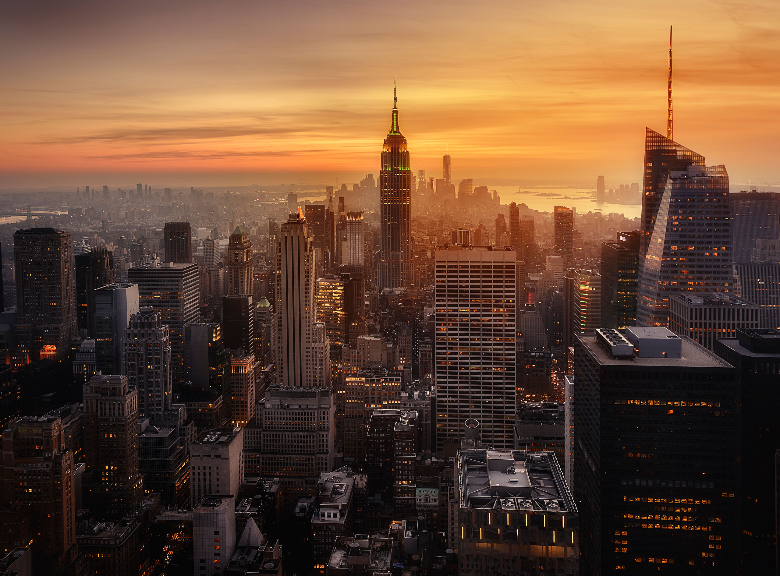
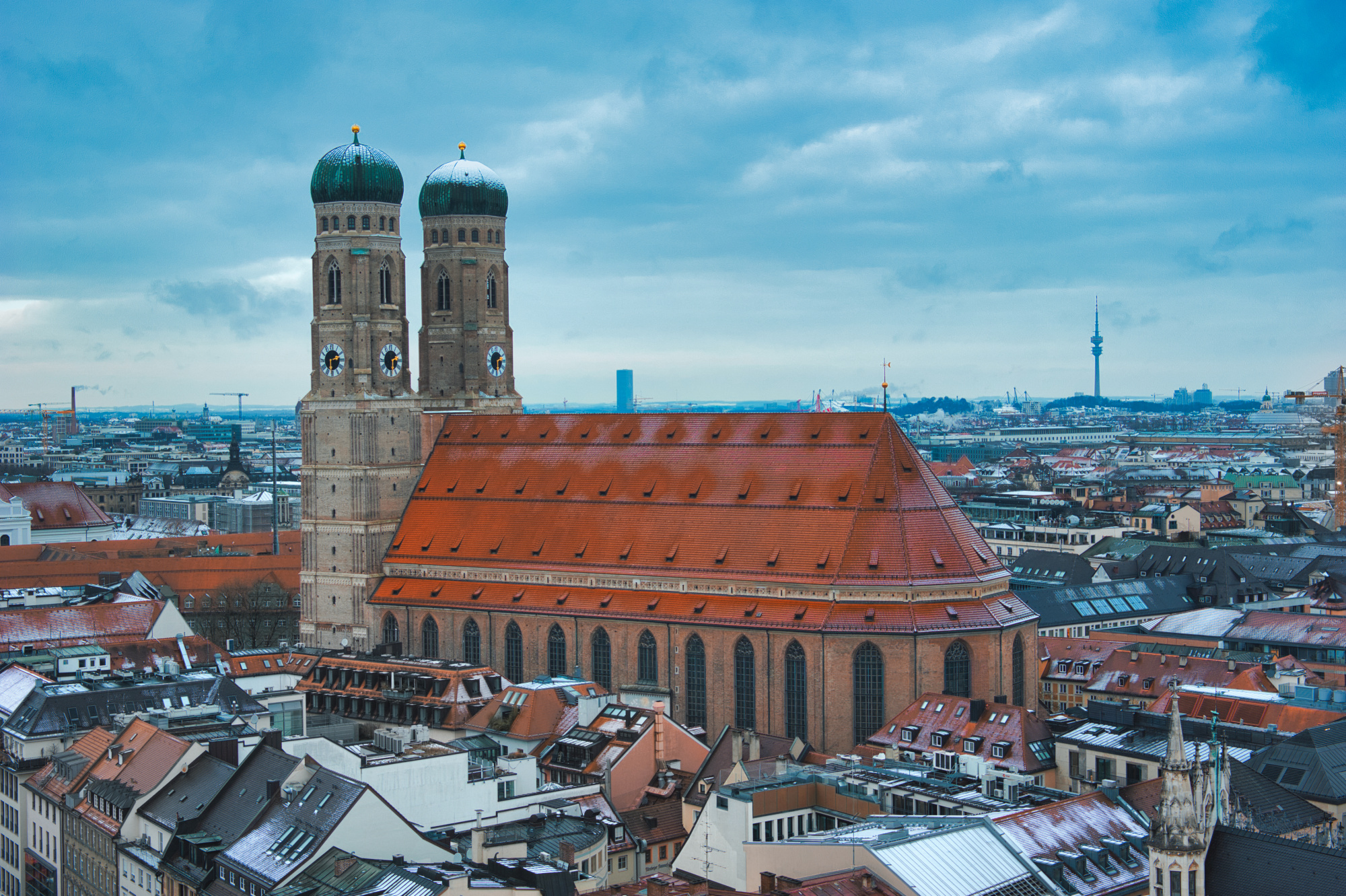
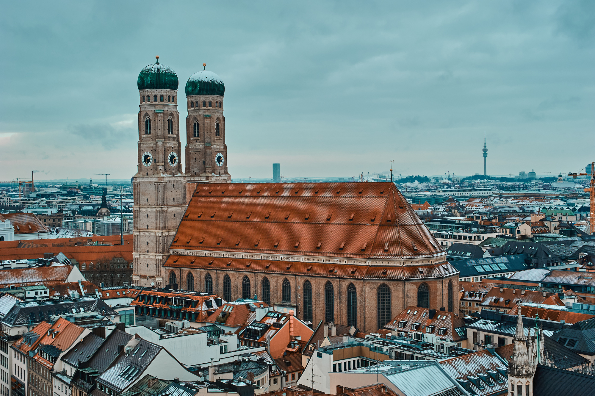
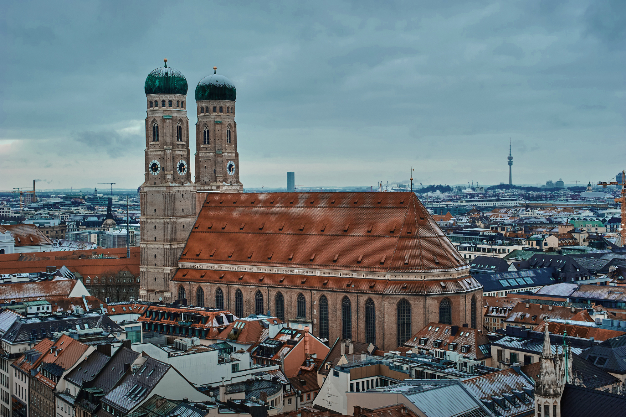
Your image - I'm with your thinking I like the sky in the top image but the building in the bottom image. I think your contrast in the lower image is far better so it looks sharper.
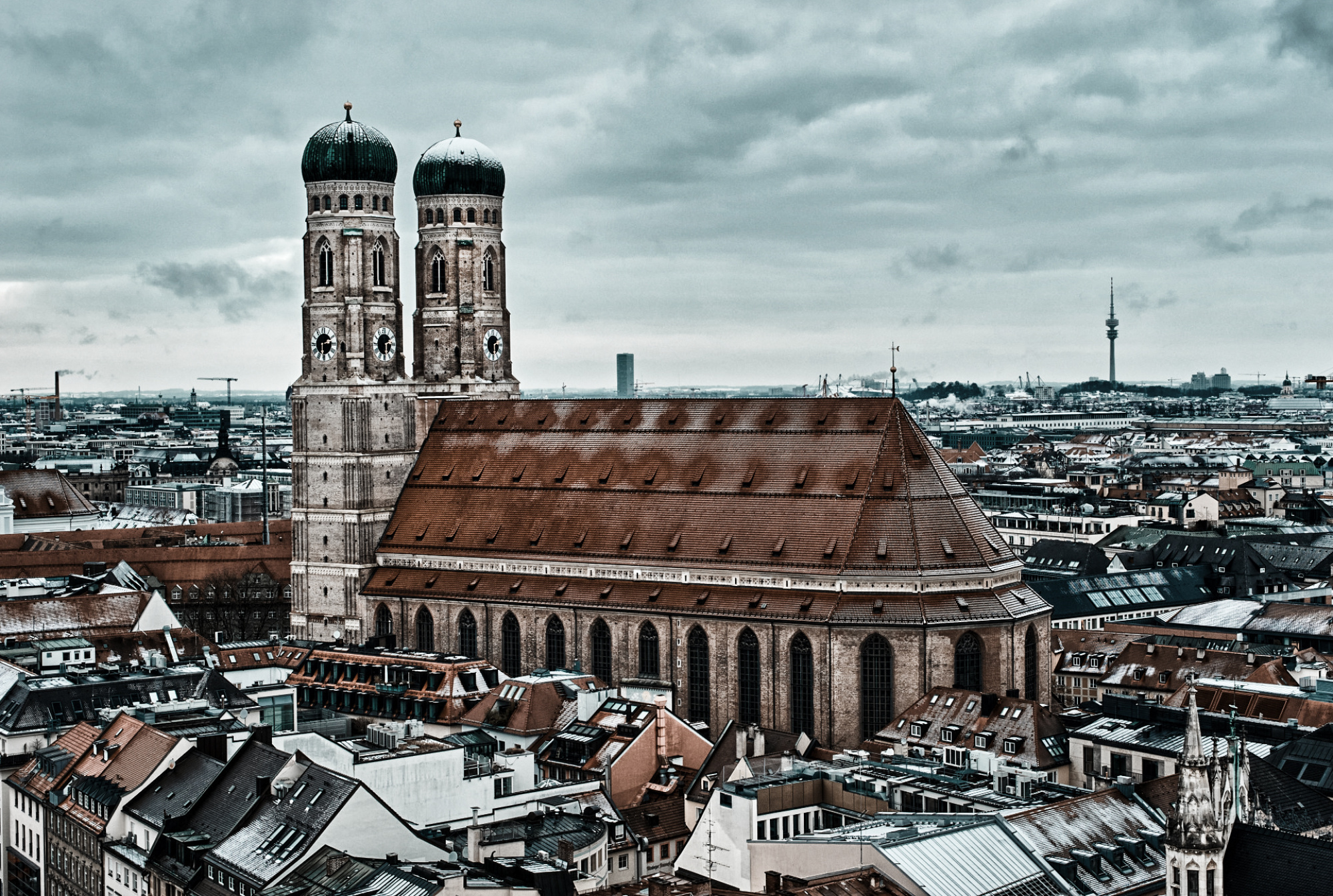
I have had your image back into Photoshop - I first tried it as a mono - it was ok but reading your words all about colour - So I used Nik Tools Color Efx Pro 4 - I think the filter I used was Bleach Bypass - I've also done a small crop to help the star of the show the main building take centre stage - I also did a little dodge and burn the clouds and the towers of the main building just to help it stand out more -
Thank you for sharing
Daniel,
First about your two images. For me the lower is better just as Daniel said there is also better detail and sharpness. But overall this image is very busy I saw that Daniel used this approuch. I went for a softer version of the second one. What I did. I brought him in Photoshop Camera raw. Tiff and jpg you can bring in Camera Raw as follows. Above FILTER>CAMERA RAW FILTER. There i used colour mixer and changed the blue above a fraction and reduced the saturation of the roof. (all orange) I used the lineair gradient to darken the lower part a fraction and the radial gradient for the towers to lighten and darkening a few parts. See if you like my version. Theo-senior critic
Dear Daniel,
Thanks for visiting us in Critique. I'll go straight to the point because you have a concrete question. I think it's only logical the second one, though not as natural, is more pleasing. The color of sky and Munich Dom are complementary in this. Do you know color.adobe.com? Here you can define color sets to apply in your work. Teal and a brown-ish orange are complimentary colors:
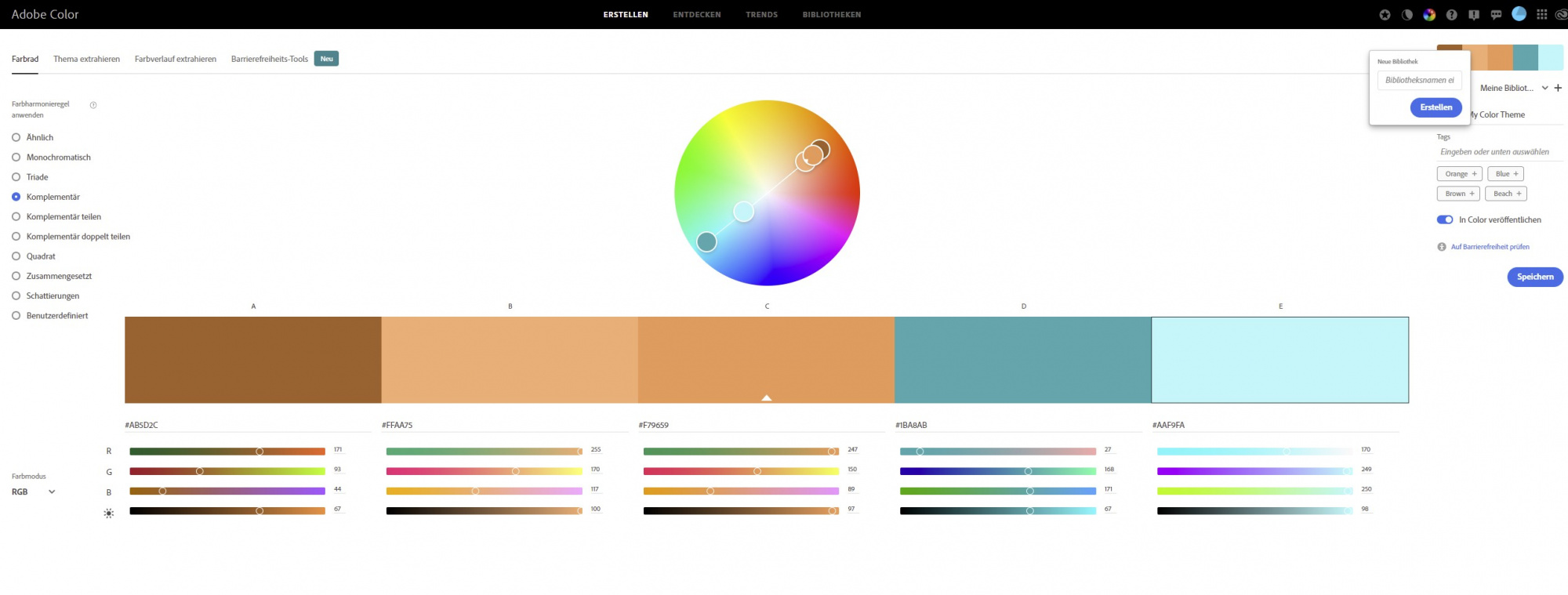
Also complimentary colors represent a degree of harmony, that's probably why you find the second edit more appealing. You can also upload a photo to the site/tool, and let it determine the most significant colors. This way you can find out your first take is "sligtly off" the harmony of complimentary color combinations:
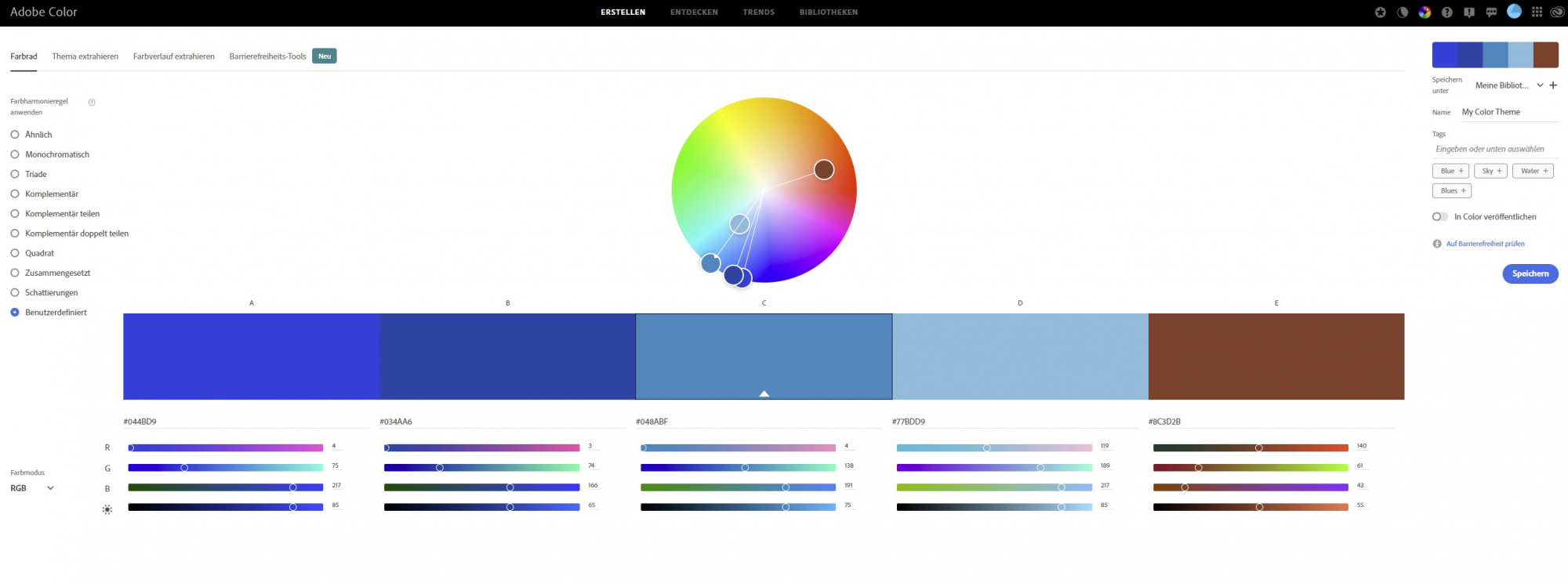
I hope this helps a bit understanding the impact of color sets.
Best regards,
Mike - senior critic
Thanks, looks like an interesting product, I'm going to look into it! Thank you for the feedabck and the nice interpretation of the photo!
Oh, this is also a nice version, thank you for the feedback!
Totally makes sense! Thanks for the explanation. And regarding the color.adobe.com: wow, never heard of it, but I've just checked it shortly and it looks amazing, this was a fantastic suggestion, thank you again!
