|
|
|
|

I have been a very long time without editing, more than a year, and finally now I have again time to focus on my passion and I feel insecure about certain concerns.
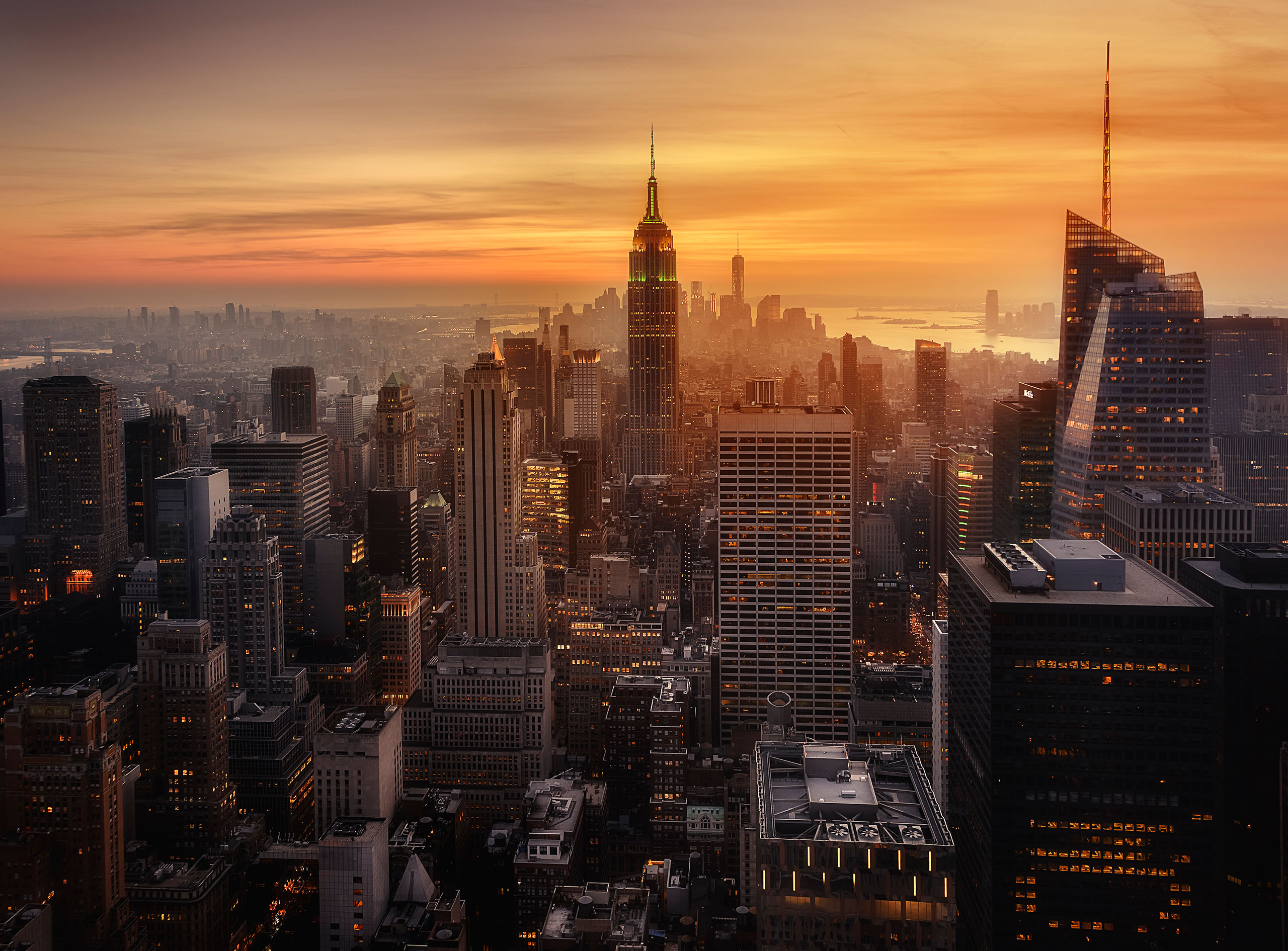
In this case I want to ask your oppinion about the whole image, as always this forum is very useful to me, but what I doubt more is about the color combination between sky and waterfall. Some days I love it, some days I feel it is quite strange. What is your oppinion/suggerences?
Thank you in advance for your time and words!!
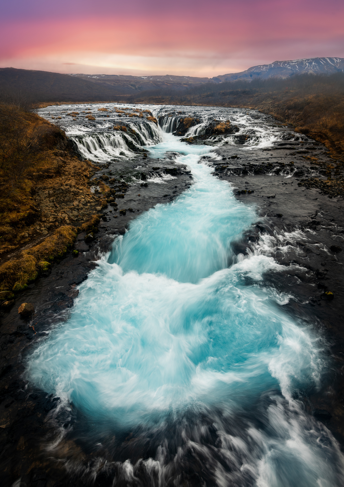
Hi Roger great looking image well composed and full of wonder well captured. You came away with a a very fine landscape well done. Just a few things to think about see attached. Some buen and dodge tool work. Topaz AI sharpen and nik tools tonal contast brushed on the land and not the sky, Last shadows opened up 30%..

Hello Roger
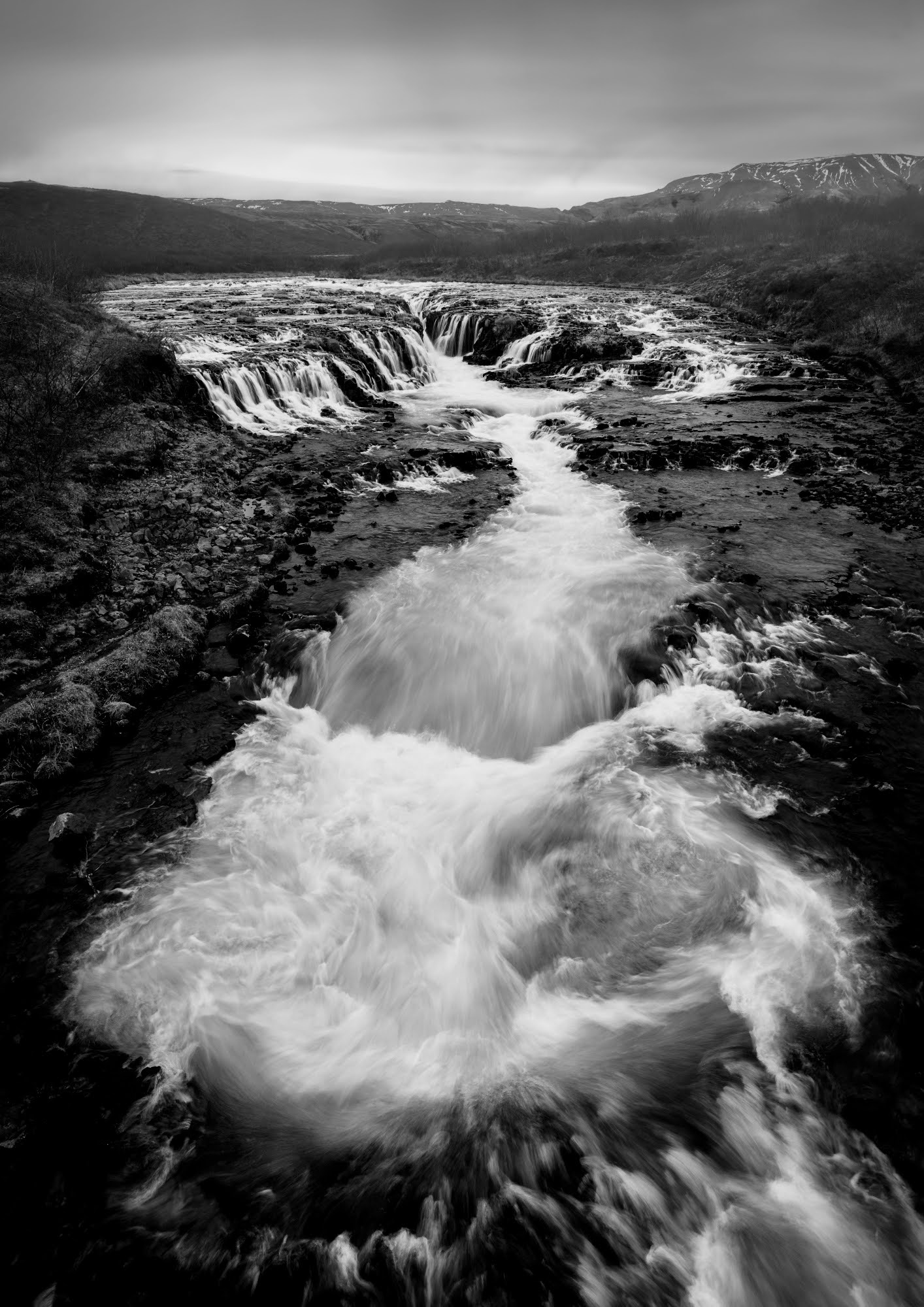
Thank you for sharing your landscape photo with us. It is a striking image with wonderful details and textures. Daniel has already offered you an excellent edit that I couldn't improve upon, so I am just wondering, should you still not be convinced of the colours, whether you might consider a black and white version that highlights all the textures and details.
Good light, Elizabeth
Hi Roger great looking image well composed and full of wonder well captured. You came away with a a very fine landscape well done. Just a few things to think about see attached. Some buen and dodge tool work. Topaz AI sharpen and nik tools tonal contast brushed on the land and not the sky, Last shadows opened up 30%..
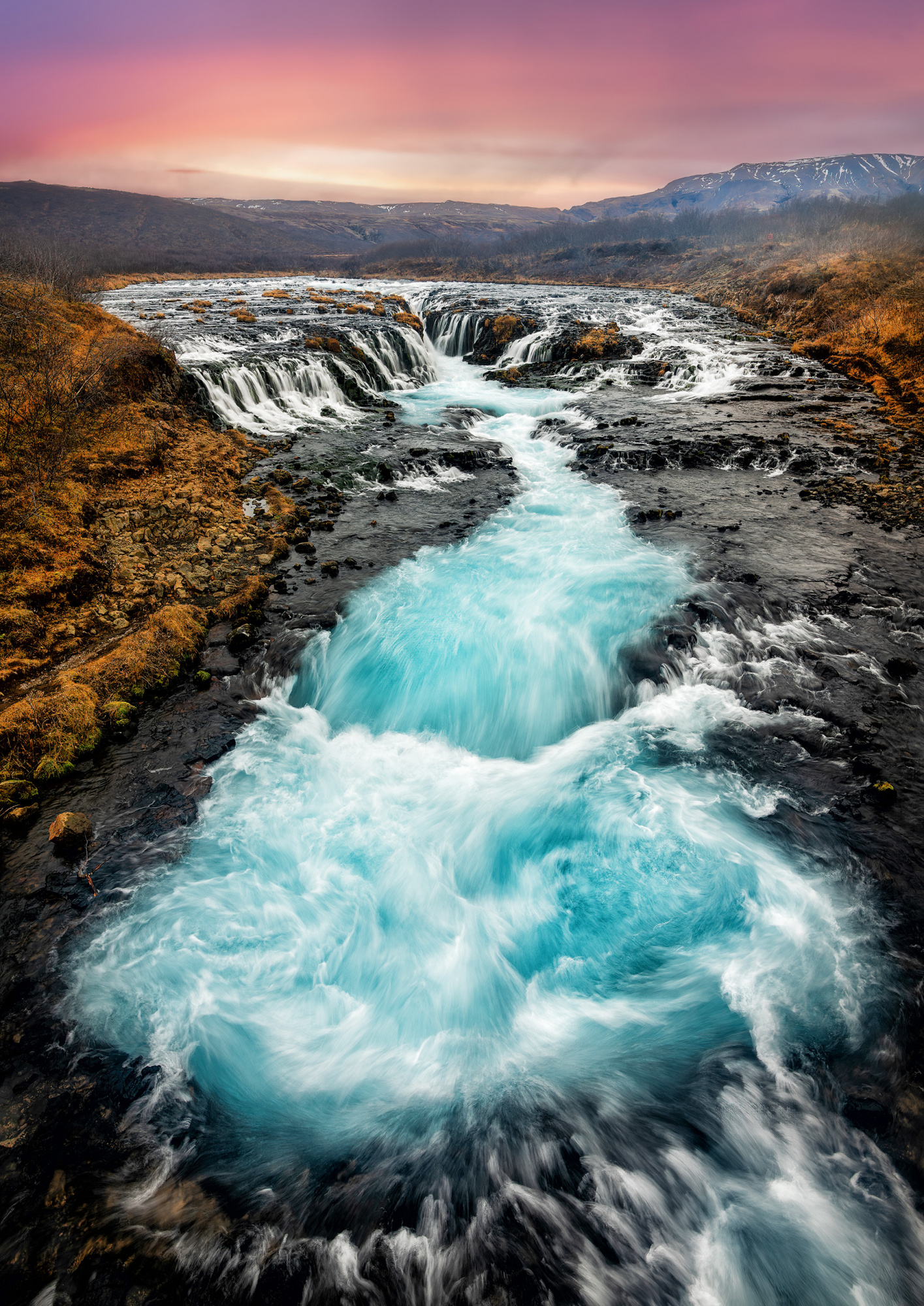
Thank you very much! I took your advice although I also tested b&w version but in this case I think that color suits better.
Hello Roger
Thank you for sharing your landscape photo with us. It is a striking image with wonderful details and textures. Daniel has already offered you an excellent edit that I couldn't improve upon, so I am just wondering, should you still not be convinced of the colours, whether you might consider a black and white version that highlights all the textures and details.
Good light, Elizabeth
Great idea! I tested it but I feel that b&w deserves more minimalistic captures and in these case I feel more stressed with b&w. But it has been a pov I haven't thought of and I love you make open my mind.
Thanks a ton!
Hello Roger, glad you are back to editing. If you are nervous about it, might I suggest downloading an image or several from the InterWeb and practice-editing those? You have no emotional jeopardy in doing that; it is just a case of re-honing your skills. (Axiomatically, do not post the results anywhere - because of copyright, etc!)
Ok, this image. You have had some interesting greyscale-monochrome advice but my personal choice would be full-colour, too. As all things it isn't a black-&-white issue! (Sorry I only do awful puns).
I do see your sky / water concern and, if we are talking literal, I agree. Now, I am quite a surrealist, so I actually like your pink sky and turquoise water - I like it a lot. And, of course, it is possible in reality if the water has leeched minerals from surrounding rocks, giving that colour-tint. But, if you want a reflection of the sky in the water, you could try selectivly somewhat desaturating the turquoise water and bringing more magenta into the water. That might produce a strange colour, too, however. In that case, try fully-desaturating the turquoise from the water and adding quite a dash of pink / magenta into it. The image certainly does not want the same strength colours in cloud and water - the water reflection will be much less saturated. (Pun not intended but what the heck?)
I prefer not to demonstrate in an image what I mean but, in this particular image, I think I prefer your original to a monochrome or to my suggestions here. But do try my suggestions for yourself if you think they might suit the image from your perspective.
Good luck.
